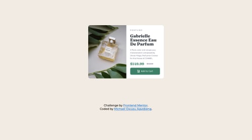
Product preview card component

Solution retrospective
the use of rem and percentage to design lengths. I will improve on it soon
Please log in to post a comment
Log in with GitHubCommunity feedback
- @Mouradis
my advice is you may have started the media to early because in this small projects you can make desktop aspect the same as the tablet one but that is not a mistake in general but the mistake the styles of your website dont work on mobile try use max-width instead of min-width in the media query i think it should fix the problem
Marked as helpful - @Coltensiemer
Hey Michael!
Great job on the challenge. This finale product is responsive as it should be.
Here is something i notice which I think would to help your product.
HTML: Instead of using 'Div' everywhere, Use <h1> and <p>. This is better practice and better for accessibility.
Here is a great resource to view about HTML syntax and structure:
https://developer.mozilla.org/en-US/docs/Learn/HTML/Introduction_to_HTML/HTML_text_fundamentals
Marked as helpful


Join our Discord community
Join thousands of Frontend Mentor community members taking the challenges, sharing resources, helping each other, and chatting about all things front-end!
Join our Discord