Submitted over 1 year agoA solution to the Product preview card component challenge
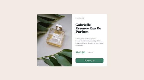
Product Preview Card Component

@Kaygp27
Code
Please log in to post a comment
Log in with GitHubCommunity feedback
- @avinno
Great job on this challenge!
I don't have any major suggestions.
- If I am being critical though, you could do without your div.container and just utilize the rest as is. The div.container is unnecessary. I used dev tools and deleted your div.container and it all sits the same.
- For accessibility and semantic reasons, I would change your div.grid to a main tag with a class name of grid instead.
- Also, for accessibility, I would include an alt value to your left-side image. I see you included alt but without a value.
- Lastly, I would add these CSS properties to your button.cta so that your icon and button text are vertically aligned centered:
- display: flex;
- flex-direction: row;
- justify-content: center;
Other than those minor suggestions (my own opinions of course), I don't think I can pick it apart any further right now. You did a beautiful job on this one! I look forward to your future project solutions!
Very Respectfully, Aaron V.
Marked as helpful

Join our Discord community
Join thousands of Frontend Mentor community members taking the challenges, sharing resources, helping each other, and chatting about all things front-end!
Join our Discord