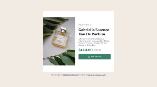
Submitted 7 months agoA solution to the Product preview card component challenge
Product preview card component solution
sass/scss

@Alfeyn
Solution retrospective
What are you most proud of, and what would you do differently next time?
all things great, and would like to do differently the responsiveness for next time.
What challenges did you encounter, and how did you overcome them?I was working on the desktop-first approach before, and now working with the mobile-first approach is challenging. I try a little bit to make it responsive.
What specific areas of your project would you like help with?The responsive part.
Code
Please log in to post a comment
Log in with GitHubCommunity feedback
- @Caleb-Abuul
You did a great job. Nice work. However, I feel that a few things could be improved on.
- To make it more accessible, use semantic HTML. That is wrap the product Card
sectionin amaintag, and the attributiondivin afootertag. Alternatively, you could usearial-labelattributes and set the value tomainon the product Cardsectiontag, andfooteron the attributiondiv. - Regarding responsiveness trying using percentages instead of rigid values such as
40remetc. to set the width of the product Card container. Also, remove theheightproperty for the container and let the content of the container decides its height. That way, when the viewport changes, the container will readjust accordingly, making it more responsive. Lastly, let the image occupy 100% of its container, since all the images are optimized.
Marked as helpful - To make it more accessible, use semantic HTML. That is wrap the product Card

Join our Discord community
Join thousands of Frontend Mentor community members taking the challenges, sharing resources, helping each other, and chatting about all things front-end!
Join our Discord