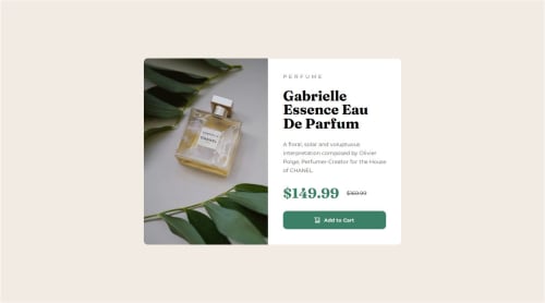
Submitted 7 months agoA solution to the Product preview card component challenge
Product preview card component Solution using Mobile-First workflow

@MandalTuhin
Solution retrospective
What are you most proud of, and what would you do differently next time?
Things I am proud of:
- I am proud of making my first responsive web page using only HTML and CSS.
- I learned how to change images based on screen size using the
<picture></picture>tag. - I learned how to use
@mediaqueries to handle responsiveness across different screen sizes. - I learned that I should focus on Mobile-first design and then add design for other screen sizes on top of it, doing the reverse can sometimes leads to messy code and messy design.
I encountered the following problems:
- I faced difficulty in making the product-image change with different screen sizes. and I used
<picture></picture>tag to solve this problem. - I faced difficulty while I tried to make the design large-screen friendly first. It lead to lot of confusion when I tried to make it work on mobile screens. I solved it by making a mobile-first design and then added css for larger screens later. This led to significant simplification of things.
I want help with the following:
- I want help with understanding web responsiveness and how to handle different screen-sizes.
- I want to learn mobile-first approach.
- I want help with box-shadows as they seem complex to me.
Code
Loading...
Please log in to post a comment
Log in with GitHubCommunity feedback
No feedback yet. Be the first to give feedback on Tuhin Mandal's solution.
Join our Discord community
Join thousands of Frontend Mentor community members taking the challenges, sharing resources, helping each other, and chatting about all things front-end!
Join our Discord