


@elaineleung
Posted
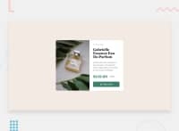
Hi Eren, your component looks great! I'd probably would just add some padding around the card's container element, which in your case is the body element; otherwise the sides of your component is touching the sides of the viewport.
Also, you can try using the letter-spacing property instead of manually adding spaces in "Perfume"; you can start with letter-spacing: 1px and then just see how much spacing you'd need. You can also use text-transform: uppercase instead of manually typing out the capital letters.
Lastly, I see that you have both the mobile and desktop images in the HTML, and I'm guessing that you are using display:none with a media query to switch between the two, which works as a solution. You can also try using responsive images with the <picture> element; you can place both images in the element along with the proper settings, and then let the browser choose the image to display. More on that here on MDN.
Once again, great job on your second challenge!
Marked as helpful
@ErenSeven
Posted
@elaineleung thanks for your nice words, i will pay attention to what you said in my next solution, thanks again for this great feedback

