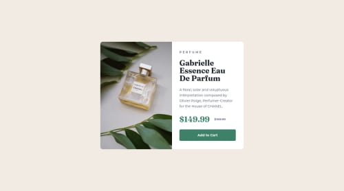
Not Found
Not Found
Not Found
Not Found
Not Found
Not Found
Not Found
Not Found
Not Found
Not Found
Not Found
Not Found
Not Found
Not Found
Not Found
Not Found
Not Found
Not Found
Not Found
Not Found

Submitted

Product preview card component solved using CSS Grid

J Z 290

@half-cto

Desktop design screenshot for the Product preview card component coding challenge

This is a solution for...

  • HTML
  • CSS
1newbie
View challenge

Design comparison


SolutionDesign

Solution retrospective


What are best practices to set up site for responsive desing.

Should put image as a background for <div>?

Community feedback

Lucas 👾 104,580

@correlucas

Posted

👾Hello JZ, Congratulations on completing this challenge!

Your solution its almost done and I’ve some tips to help you to improve it:

1.Think about using relative units as rem or em instead of px to improve your performance by resizing fonts between different screens and devices. Anyhow, if we want a more accessible website, then we should use rem instead of px. REM does not just apply to font size, but to all sizes as well.

2.Use a CSS reset to avoid all the problems you can have with the default CSS setup, removing all margins, and making the images easier to work, see the article below where you can copy and paste this CSS code cheatsheet: https://piccalil.li/blog/a-modern-css-reset/

3.Use the THE PICTURE TAG that is a shortcut to deal with the multiple images in this challenge. So you can use the <picture> tag instead of importing this as an <img> or using a div with background-image. Use it to place the images and make the change between mobile and desktop, instead of using a div or img and set the change in the css with display: none with the tag picture is more practical and easy. Note that for SEO / search engine reasons isn’t a better practice import this product image with CSS since this will make it harder to the image. Manage both images inside the <picture> tag and use the html to code to set when the images should change setting the device max-width depending of the device desktop + mobile.

Check the link for the official documentation for <picture> in W3 SCHOOLS: https://www.w3schools.com/tags/tag_picture.asp

See the example below:

<picture>
  <source media="(max-width:650px)" srcset="./images/image-product-mobile.jpg">
  <img src="./images/image-product-desktop.jpg" alt="Gabrielle Parfum" style="width:auto;">
</picture>

👨‍💻Here's my solution for this challenge if you wants to see how I build it: https://www.frontendmentor.io/solutions/product-preview-card-vanilla-css-and-custom-hover-state-on-hero-85A1JsueD1

✌️ I hope this helps you and happy coding!

Marked as helpful

1

J Z 290

@half-cto

Posted

@correlucas thank You for feedback!

0

@MelvinAguilar

Posted

Hi @half-cto 👋, good job for completing this challenge and welcome to the Frontend Mentor Community! 🎉

"Should put image as a background for <div>?": In this solution you should not use the background property on a <div> element to set the image because this image has an important semantic meaning, use CSS background property if the image is not part of the content.

Tips:

  • Don't name your class with camelCase use naming conventions to name it.
  • You can use <picture> tag when you need to change the image on different viewports, using this tag will prevent the browser from loading both images, saving bandwidth. More information here

Example:

<picture>
   <source media="(max-width: 600px)" srcset="./images/image-product-mobile.jpg">
   <img src="./images/image-product-desktop.jpg" alt="your_alt_text">
</picture>
  • You could use the <del> tag to display the old price:
<del>
   <span class="sr-only">Old price: </span>$169.99
</del>

Note that I added the <span> with the sr-only class to the del element, this will provide more information about what your old price is about.

The sr-only class is a class that you can add to hide content visually but is only visible to screen-readers:

.sr-only {
  clip: rect(0 0 0 0); 
  clip-path: inset(50%);
  height: 1px;
  overflow: hidden;
  position: absolute;
  white-space: nowrap; 
  width: 1px;
}

More information here

I hope those tips will help you.

Good Job and happy coding !

Marked as helpful

1

J Z 290

@half-cto

Posted

@MelvinAguilar Thank You for time, your comment is very helpful!!

1
100rab 60

@100-rab

Posted

you can use media query to make the site responsive, you can learn media queries through yt tutorials or from w3school website. btw great site :)

0

J Z 290

@half-cto

Posted

@100-rab thank You!

0

Please log in to post a comment

Log in with GitHub
Discord logo

Join our Discord community

Join thousands of Frontend Mentor community members taking the challenges, sharing resources, helping each other, and chatting about all things front-end!

Join our Discord