


Anar• 700
@anar-sol
Posted
Hello =)
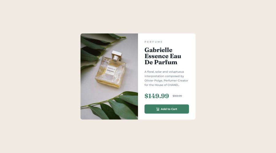
Instead of using two separate img elements, you can use picture and source to specify different images for mobile and desktop depending on the viewport size.
In my solution, I've set the mobile version as the default image and the desktop one starting at 640px width viewport.
<picture>
    <source media="(min-width: 640px)" srcset="images/image-product-desktop.jpg" width="600" height="900">
    <img src="./images/image-product-mobile.jpg" alt="Gabrielle Essence Eau De Parfum bottle" width="686" height="480" class="card__image">
</picture>
As you'll see in these MDN and web.dev articles, there are many other situations where picture and source can be useful.
Marked as helpful
0
P
@Pamellaoliveiraconte
Posted
@anar-sol Thanks for the tip, I really didn't know the <picture> tag and its attributes.
1
