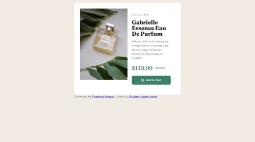
Submitted almost 2 years agoA solution to the Product preview card component challenge
Product preview card component using CSS grid and media query

@HussainAzimi
Solution retrospective
What are you most proud of, and what would you do differently next time?
I am proud to learned more about responsive design after finishing the challenge
What challenges did you encounter, and how did you overcome them?I encountered Building flexible layouts and overcame it by using Flexbox and media query.
What specific areas of your project would you like help with?Building flexible layouts
Code
Please log in to post a comment
Log in with GitHubCommunity feedback
- @CyberNotesDev
Hi! I love your use of HTML semantics and comments
Here's a little feedback to help you improve making the design a little closer!
- You can align the whole product card to the center by potentially doing
body { display:flex; flex-direction: column; justify-content: center; align-items: center; min-height: 100vh}Because since there is only essentially two children in the body (product card and 'challenge done by' div) you'll be able to center it! - Removing the padding in
.product {}to give you the perfect solution look!
Hope this helps! Happy developing! :)
- You can align the whole product card to the center by potentially doing

Join our Discord community
Join thousands of Frontend Mentor community members taking the challenges, sharing resources, helping each other, and chatting about all things front-end!
Join our Discord