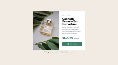
Product Preview Card Component using CSS grid + LESS

Solution retrospective
How can I make the product image even more responsive in between resizing of desktop to mobile view?
Please log in to post a comment
Log in with GitHubCommunity feedback
- @PhoenixDev22
Hello ch-andrew,
Well done! I have some suggestions regarding your solution if you don't mind:
- I recommend to use
<picture>
tag in HTML to specify image resources. The<picture>
tag contains<source>
and<img>
tags. This way the browser can choose the image that best fits the current view and/or device. If you have a small screen or device, it is not necessary to load a large image file. The browser will use the first<source>
element with matching attribute values, and ignore any of the following elements.
- The alternate text in the product image should be more descriptive.
- Specify the button type to avoid any unpredictable bugs.
- It's not recommended to capitalize in html, let css text transform take care of that. Remember screen readers won't be able to Read capitalized text as they will often read them letter by letter thinking they are acronyms.
- In HTML, the
<del>
tag is used to identify text that has been deleted from a document but retained to show the history of modifications made to the document. Strike through is a CSS property and does not carry any semantic meaning as inserted or deleted for screen readers. For screen reader:<del>
deleted indicates text removed. In this instance, the two prices are read out which can be confusing.
- The cart image in the button is a decorative image. For decorative images, you set an empty alt to it with an
aria-hidden=”true”
to remove that element from the accessibility tree. This can improve the experience for assistive technology users by hiding purely decorative images. Remember the alternate text should not be hyphenated, it should be human readable.
- You should use
object-fit: cover;
to the image which sets how the image should be resized to fit its container.object-fit: cover;
maintains its aspect ratio while filling the element's entire content box.
- Remember a modern css reset on every project that make all browsers display elements the same.
Overall, great work! hopefully this feedback helps.
Marked as helpful - I recommend to use
Join our Discord community
Join thousands of Frontend Mentor community members taking the challenges, sharing resources, helping each other, and chatting about all things front-end!
Join our Discord