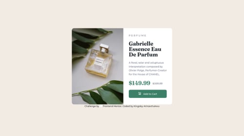
Not Found
Not Found
Not Found
Not Found
Not Found
Not Found
Not Found
Not Found
Not Found
Not Found
Not Found
Not Found
Not Found
Not Found
Not Found
Not Found
Not Found
Not Found
Not Found
Not Found

Submitted

Product preview card component using flexbox

@ArthurKingDev

Desktop design screenshot for the Product preview card component coding challenge

This is a solution for...

  • HTML
  • CSS
1newbie
View challenge

Design comparison


SolutionDesign

Solution retrospective


Hi everyone! I finished the product preview card component challenge. kindly take a look and give me feedback if there is something I need to do better. Thanks.

Community feedback

Lucas πŸ‘Ύβ€’ 104,560

@correlucas

Posted

πŸ‘ΎHi Kingsley Arinzechukwu, congrats on completing this challenge!

You did a good work putting everything together in this challenge, something you can do to improve the image that needs to change between mobile and desktop is to use <picture> instead of <img> wrapped in a div. Look that for SEO and search engine reasons isn’t a better practice import this product image with CSS since this will make harder to the image be found. You can manage both images inside the <picture> tag and use the html to code to set when the images should change setting the device max-width depending of the device (phone / computer) Here’s a guide about how to use picture: https://www.w3schools.com/tags/tag_picture.asp

✌️ I hope this helps you and happy coding!

Marked as helpful

0

@ArthurKingDev

Posted

@correlucas I actually had an option to choose between the two method , I did otherwise with no knowledge of the significance of using the <picture> tag.

Your feedback has always been insightful. Thank you and congrats on winning the mentor of the week!

0
Elaineβ€’ 11,420

@elaineleung

Posted

Hi Kingsley, good job putting this together! 😊 I got a few suggestions for you here:

  1. Instead of using background-image for handling the switching of the desktop and mobile images, try to use the picture element instead since this is a product image and is thus central to the card. The background-image property is suitable for images that really are background images, usually with some text on top of the image. For the picture element, you can try something like this:

    <picture>
       <source media="(max-width: 375px)" srcset="image-mobile.png" />
       <img src="image-desktop.png" alt="Glass perfume bottle placed against a leafy background" />
    </picture>
    
  2. I suggest a higher breakpoint than 375px. The 1440px desktop view and 375px mobile views are references for you to see how the component should look like that these two views, but they aren't meant to be the max width or breakpoint. As the developer, you'll have to have the judgment to see which point to use so that when the layout changes, the component can still have optimal views.

  3. Right now the component isn't so responsive due to fixed widths in certain areas, and as a result, there is content that's being covered by the browser, causing overflow to happen. A big part of this could be the fact that you're using background images right now, but you can also try what I mentioned about changing the breakpoint as well.

  4. To make the image width even with the text in the desktop layout, try adding flex: 1 0 50%; on the product-img.

Hope some of this can help you out, and really great work on the whole, so keep going!

Marked as helpful

0

@ArthurKingDev

Posted

@elaineleung this is too many knowledge in a piece! Thank you and congrats on winning top mentor of the week!

1
Elaineβ€’ 11,420

@elaineleung

Posted

@ArthurKingDev You're welcome, Kingsley, and thank you also 😊

0

Please log in to post a comment

Log in with GitHub
Discord logo

Join our Discord community

Join thousands of Frontend Mentor community members taking the challenges, sharing resources, helping each other, and chatting about all things front-end!

Join our Discord