


@correlucas
Posted
👾Hello Hayley, congratulations for your new solution!
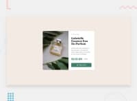
I've checked your solution live site and code an this is a really nice solution. You've paid attention to the design details, the solution is responsive, the image too (nice that you've used object-fit:cover).
Note that your solution is responsive but some info doesn't fit in the desktop version after the max-width: 800px because the text is really big, maybe is a better idea gets the media query mobile on a little bit earlier in this case.
You've used overflow: hidden but note that this is cropping the text when the container scales down. Maybe is a better idea to use border-radius for the image to have the same roundness of the container and don't use overflow: hidden.
An alternative is to give the mobile version a media query with text with a smaller font-size to have the card content fitting the container. For example the h1 could be around 20px and the paragraph around 12px.
👋 I hope this helps you and happy coding!
