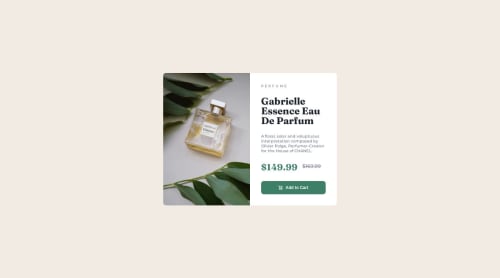
Submitted over 1 year agoA solution to the Product preview card component challenge
Product Preview Card Component using Object fit property

@kylecloete
Solution retrospective
So a few things mentioned in my previous challenges that I have made use of
- I managed to center my object on the viewport
- I have made use of landmark tags such as main and footer
Something I had a hard time with
- trying to get the image to change from the desktop to the mobile version.
- I tried making use of a div element and changing it using CSS but no luck(maybe I was just being stupid)
So using what I know I came up with this solution, please let me know if there is anything I can change to improve on this solution
Code
Please log in to post a comment
Log in with GitHubCommunity feedback
- @ahmedafsa
Hello @kylecloete, great work!
- Regarding the product image It is better to use the
<picture>element with<source>tags to make it responsive where based on your screen width, the appropriate image will be loaded instead of the two<img>elements.
<picture>
  <source
    srcset="images/image-product-mobile.jpg"
    media="(max-width: 600px)"
  />
  <source
    srcset="images/image-product-desktop.jpg"
    media="(min-width: 601px)"
  />
  <img src="images/image-product-desktop.jpg"/>
</picture>
Best wishes to you!
Marked as helpful - Regarding the product image It is better to use the

Join our Discord community
Join thousands of Frontend Mentor community members taking the challenges, sharing resources, helping each other, and chatting about all things front-end!
Join our Discord