Skip to content
  • Unlock Pro
  • Log in with GitHub
Solution
Submitted over 2 years ago

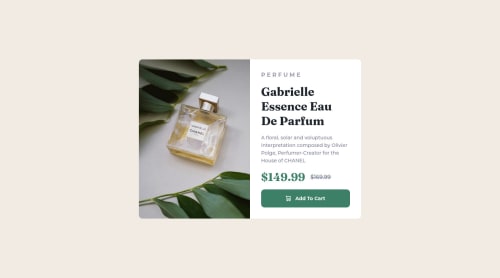
Product preview card component using only html and css

mohamed magdy•110
@mohamed-magdy26
A solution to the Product preview card component challenge
View live sitePreview (opens in new tab)View codeCode (opens in new tab)

Solution retrospective


well, I'm feeling that the image part is not best practice is there anyway I can use img tag for image while changing the "src" attribute for different query ? I had to use background image for this to handle but I had a problem that the div has no height when I made the responsive design so I had to give it min-height to image height? also when I used the img tag when I increase gap between elements the component height increase but the image height did not which made a white area under the image

Code
Couldn’t fetch repository

Please log in to post a comment

Log in with GitHub

Community feedback

  • Steven Croft•170
    @scroft001
    Posted over 2 years ago
    • You can use the <picture> tag when you have different versions of the same image. Using the <picture> tag will help you to load the correct image for the user's device saving bandwidth and improving performance.
       <picture>
          <source media="(max-width: 460px)" srcSet={mobileImage} />
          <img src={desktopImage} alt="{your alt text goes here}" />
        </picture>
    
    Marked as helpful
  • Jethier•390
    @jCasia
    Posted over 2 years ago

    Hello! First of all, congratz on completing the challenge!!😀

    I was just looking at your code and wanted to help fix the responsiveness

    @media (max-width: 687px) { 
    
    .preview-card {
     grid-template-columns: 1fr;
     grid-template-rows: repeat(2, 1fr);  <--"Add this to specify how many rows you want in your grid,  your image does not know where to go, this should solve the problem"
     max-height: 40rem;  <--"add this so your card container won't get bigger than 40rem(640px)"
     margin: 0 2rem;  <-- "put a margin right and left to make it look neater"
      }
    
    .preview-card .img {
     min-height: 360px;  <--"remove this as this will restrict the height to 360px and the image will not go any smaller, so this limits the image to resize in smaller widths"
     border-radius: 10px 10px 0 0;
     background-image: url(/images/image-product-mobile.jpg);
    
    **when creating a grid, its good to specify which cells each element/div should be in the grid for example**
    
     grid-row:1/2;
     grid-column:1/2;
      }
    }
    

    I'm sorry if its a bit messy, but I hope I helped you out even its just a little bit

    Marked as helpful

Join our Discord community

Join thousands of Frontend Mentor community members taking the challenges, sharing resources, helping each other, and chatting about all things front-end!

Join our Discord

Stay up to datewith new challenges, featured solutions, selected articles, and our latest news

Frontend Mentor

  • Unlock Pro
  • Contact us
  • FAQs
  • Become a partner

Explore

  • Learning paths
  • Challenges
  • Solutions
  • Articles

Community

  • Discord
  • Guidelines

For companies

  • Hire developers
  • Train developers
© Frontend Mentor 2019 - 2025
  • Terms
  • Cookie Policy
  • Privacy Policy
  • License

Oops! 😬

You need to be logged in before you can do that.

Log in with GitHub

Oops! 😬

You need to be logged in before you can do that.

Log in with GitHub

How does the accessibility report work?

When a solution is submitted, we use axe-core to run an automated audit of your code.

This picks out common accessibility issues like not using semantic HTML and not having proper heading hierarchies, among others.

This automated audit is fairly surface level, so we encourage to you review the project and code in more detail with accessibility best practices in mind.

How does the CSS report work?

When a solution is submitted, we use stylelint to run an automated check on the CSS code.

We've added some of our own linting rules based on recommended best practices. These rules are prefixed with frontend-mentor/ which you'll see at the top of each issue in the report.

The report will audit all CSS, SCSS and Less files in your repository.

How does the HTML validation report work?

When a solution is submitted, we use html-validate to run an automated check on the HTML code.

The report picks out common HTML issues such as not using headings within section elements and incorrect nesting of elements, among others.

Note that the report can pick up “invalid” attributes, which some frameworks automatically add to the HTML. These attributes are crucial for how the frameworks function, although they’re technically not valid HTML. As such, some projects can show up with many HTML validation errors, which are benign and are a necessary part of the framework.

How does the JavaScript validation report work?

When a solution is submitted, we use eslint to run an automated check on the JavaScript code.

The report picks out common JavaScript issues such as not using semicolons and using var instead of let or const, among others.

The report will audit all JS and JSX files in your repository. We currently do not support Typescript or other frontend frameworks.

Oops! 😬

You need to be logged in before you can do that.

Log in with GitHub

Oops! 😬

You need to be logged in before you can do that.

Log in with GitHub