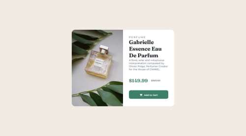
Product Preview Card Component

Solution retrospective
I'm proud of implementing responsive images using srcset and sizes to optimize performance across different screen sizes. It ensures the site looks great on both desktop and mobile.
What challenges did you encounter, and how did you overcome them?Next time, I’d experiment more with advanced CSS techniques like Grid and add more interactive elements using JavaScript to enhance the user experience.
What specific areas of your project would you like help with?The most challenging part was ensuring the images loaded correctly across devices. By using srcset and sizes, I overcame this by specifying different image sizes for various screen widths, which optimized the page load time.
Please log in to post a comment
Log in with GitHubCommunity feedback
No feedback yet. Be the first to give feedback on FrontEndExplorer-Temp's solution.
Join our Discord community
Join thousands of Frontend Mentor community members taking the challenges, sharing resources, helping each other, and chatting about all things front-end!
Join our Discord