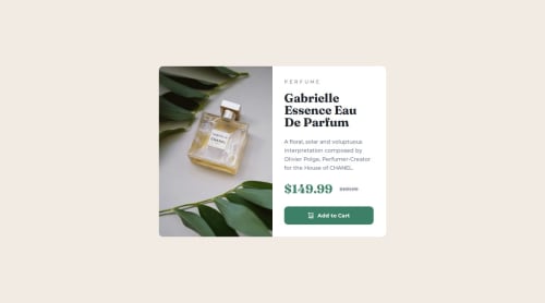
Product preview card component

Solution retrospective
I tried to get it as close to the design as I could, it's not 100% the same but fairly close I think...
Next time I'd probably spend more time trying figure out how the picture and source tags worked and use them in the code.
What challenges did you encounter, and how did you overcome them?I found changing the images from mobile to desktop more challenging than I thought it would be. I found various ways this can be done, setting the images as a background images and changing with CSS but realised it's not really a good practice if the image is considered part of the content.
Also discovered the picture tag, source tag and the srcset attribute which can be used to select images based on screen width and more, but apparently not all browsers support this and also read about browser cache issues and not loading the alternative image/s when needed?
In the end I went for putting both images in the html and using display:none; on the desktop image when in mobile size and then toggling them when needed within the media query.
Seems to work but not sure if this was the best solution?
What specific areas of your project would you like help with?Any feedback, pointers and suggested improvements are welcome... Thanks.
Please log in to post a comment
Log in with GitHubCommunity feedback
No feedback yet. Be the first to give feedback on WB52’s solution.
Join our Discord community
Join thousands of Frontend Mentor community members taking the challenges, sharing resources, helping each other, and chatting about all things front-end!
Join our Discord