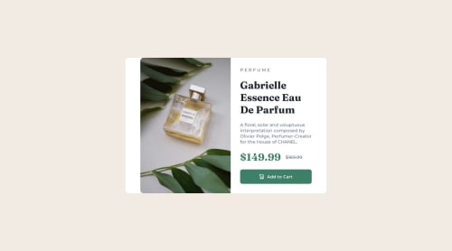
Product Preview Card Solution

Solution retrospective
I don't know how I can take the white bar in the left off, so I accept any suggestion to how a can make it. I also wanna learn other way to centralize all the container without using the properties of position and transform. Anyone know other methods or can recommend me a site who teaches about this?
Please log in to post a comment
Log in with GitHubCommunity feedback
- @jonathan401
Congratulations on completing this challenge 🎊🎊. Well a few suggestions:
- Let the div with class
containerbe amainelement instead. - There should only be a
h1element per page. So you make the otherh1ah2instead. - It's important that you don't write content in all caps in the html. You should change PERFUME to Perfume and then use the CSS
text-transform: uppercase;in the CSS to make it all caps. - To remove that space from the image, you should add a picture element that can be used to render different images for different screen sizes. You could check out my solution here and if you're still not clear, you could reach out. Hope the little suggestions helped.
Once again, congratulations on completing this challenge 🎊🎊.
- Let the div with class
Join our Discord community
Join thousands of Frontend Mentor community members taking the challenges, sharing resources, helping each other, and chatting about all things front-end!
Join our Discord