Skip to content
  • Unlock Pro
  • Log in with GitHub
Solution
Submitted about 3 years ago

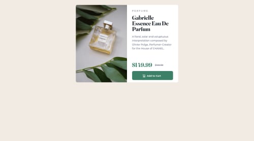
Product Preview Card solution using plain old HTML and CSS Grid

Jordan•140
@joanFaseDev
A solution to the Product preview card component challenge
View live sitePreview (opens in new tab)View codeCode (opens in new tab)

Solution retrospective


Hello Everyone! First and foremost, english isn't my first language so please forgive me for any mispellings or grammatical errors. There's two questions that i asked myself during this project and i'd hoped that maybe someone could help me shine some light on theses matters.

  1. Responsive Web Design seemed to be mandatory nowadays but, when starting a design, is it better to first build the mobile design and then add complexity toward the bigger resolutions (laptop, desktop, etc) or the other way around? I'm an aspiring front-end developper and my first thought is to make the mobile layout first because there's less space to cover which means less complexity which seems really reassuring to me but i'd like to hear your more experience views on the subject.

  2. This is my second project on Frontend Mentor and i noticed that the HSL color system seems to be preferred. I wonder if there was any particular reason. I thought rgb, hex and hsl were favorted by some and others due to personal preferences but maybe there's a more technical explanation?

Again i'm sorry for my poor writing. And if you guys feel like giving any feedback whatsoever, i'll gladly hear about it. Have a nice day and happy coding to all!

Code
Select a file

Please log in to post a comment

Log in with GitHub

Community feedback

  • mubizzy•1,520
    @mubizzy
    Posted about 3 years ago

    Excellent job on this challenge! your report has a few issues though:

    1. wrap everything in your body in <main> or use semantics

    2.   it is a best practice to use both HTML 5 and ARIA landmarks to ensure all     content is contained within a navigational region.

    Hope it helps:)...don't forget to mark it as helpful 👍

    You can get more details here...click here

  • IRVINE MESA•1,835
    @DrMESAZIM
    Posted about 3 years ago

    Hi Jordan

    yes I prefer mobile first when styling my CSS . that is good practice should keep going in that direction

    secondly the as beginner I advice you to not read to much on color codes unless it affects the outlook appearance, From my experience I used plain noun English words for colors as starter.

    lastly I want to place the project at the center of the screen this looked difficult to explain since I would need to do lots of coding and changes , still I can do it with my screen recorder and send you YouTube video for the work if your are interested let me know

  • P
    Adam Winzenburger•230
    @adamwinzdesign
    Posted about 3 years ago

    I don't know if one format would be considered to be preferred over the other technically, but for the larger projects that I've seen here, when you get the figma design files, they typically include a color system guide that includes the color values in hex, rgb, and hsl, so you should be able to use whichever format you prefer without even having to convert the values yourself.

Join our Discord community

Join thousands of Frontend Mentor community members taking the challenges, sharing resources, helping each other, and chatting about all things front-end!

Join our Discord

Stay up to datewith new challenges, featured solutions, selected articles, and our latest news

Frontend Mentor

  • Unlock Pro
  • Contact us
  • FAQs
  • Become a partner

Explore

  • Learning paths
  • Challenges
  • Solutions
  • Articles

Community

  • Discord
  • Guidelines

For companies

  • Hire developers
  • Train developers
© Frontend Mentor 2019 - 2025
  • Terms
  • Cookie Policy
  • Privacy Policy
  • License

Oops! 😬

You need to be logged in before you can do that.

Log in with GitHub

Oops! 😬

You need to be logged in before you can do that.

Log in with GitHub

How does the accessibility report work?

When a solution is submitted, we use axe-core to run an automated audit of your code.

This picks out common accessibility issues like not using semantic HTML and not having proper heading hierarchies, among others.

This automated audit is fairly surface level, so we encourage to you review the project and code in more detail with accessibility best practices in mind.

How does the CSS report work?

When a solution is submitted, we use stylelint to run an automated check on the CSS code.

We've added some of our own linting rules based on recommended best practices. These rules are prefixed with frontend-mentor/ which you'll see at the top of each issue in the report.

The report will audit all CSS, SCSS and Less files in your repository.

How does the HTML validation report work?

When a solution is submitted, we use html-validate to run an automated check on the HTML code.

The report picks out common HTML issues such as not using headings within section elements and incorrect nesting of elements, among others.

Note that the report can pick up “invalid” attributes, which some frameworks automatically add to the HTML. These attributes are crucial for how the frameworks function, although they’re technically not valid HTML. As such, some projects can show up with many HTML validation errors, which are benign and are a necessary part of the framework.

How does the JavaScript validation report work?

When a solution is submitted, we use eslint to run an automated check on the JavaScript code.

The report picks out common JavaScript issues such as not using semicolons and using var instead of let or const, among others.

The report will audit all JS and JSX files in your repository. We currently do not support Typescript or other frontend frameworks.

Oops! 😬

You need to be logged in before you can do that.

Log in with GitHub

Oops! 😬

You need to be logged in before you can do that.

Log in with GitHub

Oops! 😬

You need to be logged in before you can do that.

Log in with GitHub