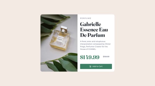
Not Found
Not Found
Not Found
Not Found
Not Found
Not Found
Not Found
Not Found
Not Found
Not Found
Not Found
Not Found
Not Found
Not Found
Not Found
Not Found
Not Found
Not Found
Not Found
Not Found

Submitted

Product Preview Card using CUBE CSS

#accessibility#cube-css
P
Alexβ€’ 1,990

@AlexKMarshall

Desktop design screenshot for the Product preview card component coding challenge

This is a solution for...

  • HTML
  • CSS
1newbie
View challenge

Design comparison


SolutionDesign

Solution retrospective


I'm pretty happy with this. I normally build apps, so this was a good opportunity to experiment more with fluid typography and intrinsic design.

I'm not 100% happy about having to specify the grid column widths for the large viewport. I would've liked it that the image took up enough space as it needed to maintain its aspect ration, while the content section expanded in width as much as it needed. But I couldn't get that to work. The repeat(2, 1fr) grid seemed like an acceptable compromise.

Community feedback

@Christ-Kevin

Posted

Hi Alex,

congratulation. you have a nice looking website. I would like to give you some ideas how you can avoid the html validation issues. I think your website can look better if you define the width and height of your images in the css and not in the html file. While defining the width and the height in your css you can use min and max values if the image size increase too fast with the viewport compare to the container size.

Another issue is the alignment of your second price. it should have the same alignment as the first one. My suggestion would be to use the "Β " to create space between the first price and the second one, then you should use another span for the second price. And to make sure that the second price is vertically in the middle of the container you can make " display: inline-flex; align-items: center;" for your spans.

I hope this could help you

Happy coding

Christ

Marked as helpful

0

P
Alexβ€’ 1,990

@AlexKMarshall

Posted

@Christ-Kevin

Thanks very much for your comment.

It's important to put image dimensions in the HTML to avoid layout-shift, otherwise, you have a poor experience if the image loads slowly, and you'll potentially be penalized by search engine ranking. The browser needs to reserve space for the image and know its dimensions to serve the correct image file. Why exactly the validator is throwing an error in this is unclear. It shouldn't, this meets the spec. For further details of the technique I've used here you can take a look at how to use the picture element to serve images with different aspect ratios (sometimes called art direction) https://web.dev/learn/design/picture-element/#cropping

For the prices it would certainly be valid to align both of them to the center of the container. For my personal taste that alignment doesn't work particularly well visually. Hence the tweak to shift it slightly with translateY. The design is also not center-aligned (though it's slightly closer to center than mine).

Using a space to separate elements is sometimes a good idea, but in a flexbox whitespace is automatically collapsed by default, so using gap gives greater control. It also allows flexibility over how big the space should be.

1

@Christ-Kevin

Posted

@AlexKMarshall Thanks for your comment and for the ressource that helps me to know more about responsive design. Could you please check my solution(https://www.frontendmentor.io/solutions/product-preview-using-html-css-flexbox-and-advanced-selectors-J4-eESxVUm) and make some recommendation if possible ? I would be grateful.

Happy coding

0

Please log in to post a comment

Log in with GitHub
Discord logo

Join our Discord community

Join thousands of Frontend Mentor community members taking the challenges, sharing resources, helping each other, and chatting about all things front-end!

Join our Discord