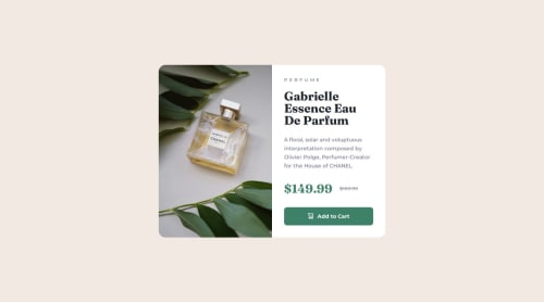
Product Preview Card Using FlexBox

Solution retrospective
-
Positioning elements and using the
<picture>tag to swap images based on screen width:Using the
<picture>tag allows for optimizing the loading of different versions of images depending on the device's resolution. This ensures that users on different devices, such as phones, tablets, or desktop computers, will receive appropriately selected images, which not only improves the appearance of the site but also its performance. -
Responsiveness of the project, adapting the layout to different devices and screen widths:
Responsiveness was one of the key elements I focused on. By using CSS techniques like flexbox, media queries, and proper width settings in percentages, the design automatically adjusts to various screen sizes, providing an optimal user experience across all devices.
-
Positioning the image to occupy the full width of the column:
One of the biggest challenges was positioning the image correctly so that it would occupy the full width of the column, while maintaining the appropriate proportions and appearance. I had to research optimal CSS settings to achieve this effect without negatively affecting the responsiveness of the site. By using
object-fit: coverand appropriate margins, I was able to get the desired result. -
Setting the
<picture>tag to swap images based on screen width:Another challenge was configuring the
<picture>tag properly to ensure the image automatically changes based on screen resolution. I had to carefully define different image sources within thesrcsetattribute and set the appropriate media queries. This solution ensures that on mobile devices, a smaller, optimized version of the image is loaded, improving the page load time.
-
Have I correctly set up the images in the project to meet the project requirements?
-
Overall readability and clarity of the code.
-
Responsiveness: Is the page fully responsive?
Please log in to post a comment
Log in with GitHubCommunity feedback
No feedback yet. Be the first to give feedback on Konrad's solution.
Join our Discord community
Join thousands of Frontend Mentor community members taking the challenges, sharing resources, helping each other, and chatting about all things front-end!
Join our Discord