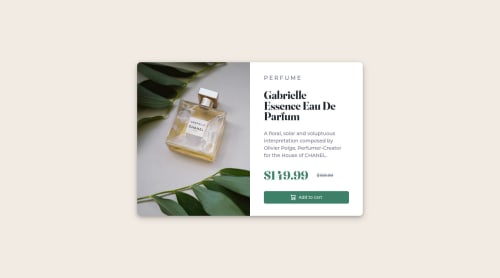
Product preview card using HTML, flexbox, and custom CSS

Solution retrospective
I used media queries to create the mobile view, are there other ways of doing this that are more elegant? I liked using bootstrap because it seemed to automatically resize elements based on the viewport size but I wanted to try to approach this challenge without using bootstrap.
Please log in to post a comment
Log in with GitHubCommunity feedback
- @correlucas
Hello Major, congratulations for your solution!
For this challenge I don't think you can get rid of the media queries because the desktop card is horizontal and the mobile version is vertical. In other cases there's a flexbox property that can help you automatically break the elements as the screen become smaller, the
flex-wrap: wrap;.For sure bootstrap is a good resource, it come with a lots of tools and pre-made classes and you don't have to worry about creating the whole CSS and think about responsivity. Although isn't a good fit if you're a newbie like me for example, because you don't really learn and understand what is happening, why one property is better in a situation than the other... so if you want really learn CSS I think you should stick to Vanilla CSS, that's the normal CSS and them you can use a framework as bootstrap or tailwind, to build big applications/lading pages for example, this is only my personal opinion. But anyway you reached a great result using bootstrap, looks very cool!
Consider also look the solution report panel, there's some issues there, you'll learn a lots about semantic fixing these errors, its a great Frontend Mentor tool to use!
Happy coding!
Marked as helpful
Join our Discord community
Join thousands of Frontend Mentor community members taking the challenges, sharing resources, helping each other, and chatting about all things front-end!
Join our Discord