Submitted 3 months agoA solution to the Product preview card component challenge
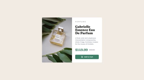
Product Preview Card using tailwindcss, next.js
react, tailwind-css, next

P
@BlonoBuccellati
Solution retrospective
What are you most proud of, and what would you do differently next time?
I’ve become more comfortable with responsive design and don’t struggle with styling as much as before.
Next, I want to dive deeper into responsive techniques and then move on to accessibility.
What specific areas of your project would you like help with?- Are there any parts of the current code that could be made more semantic?
- Are there any unnecessary CSS styles that could be removed?
- Is there a way to write the CSS in a cleaner or more maintainable way?
If you notice anything else that could be improved, feel free to let me know.
Code
Please log in to post a comment
Log in with GitHubCommunity feedback
- @GreccoOliva-Franco
- You provide a quite "good enough" solution
- As like my solution, there are some discrepancies in letters, letter spacing, line height that produce a difference compared to the design provided. Even if taken that into account, I would feel proud of the solution provided
- I liked a lot the way you used CSS variables and that we matched the whole STACK too.
Nice job!

Join our Discord community
Join thousands of Frontend Mentor community members taking the challenges, sharing resources, helping each other, and chatting about all things front-end!
Join our Discord