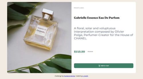
Product Preview Card with Responsive Layout

Solution retrospective
This was my first project with a responsive layout. I am happy about learning to use picture and multiple image sources in conjunction with changing layouts.
Next time, I would like to be more sure about the dynamic spacing and text sizes to use.
What challenges did you encounter, and how did you overcome them?At first I was attempting to apply an image with a source set to change between completely different images given different image sizes. I discovered that the more explicit way of defining breakpoints using pictures better suited this scenario.
What specific areas of your project would you like help with?I am still unsure of the best way to make text size dynamic. I have thought about using clamp along with view height units for the font size. Would it be best to set the root element font size in this way and then use rem units everywhere?
Thanks
Please log in to post a comment
Log in with GitHubCommunity feedback
No feedback yet. Be the first to give feedback on Andrew's solution.
Join our Discord community
Join thousands of Frontend Mentor community members taking the challenges, sharing resources, helping each other, and chatting about all things front-end!
Join our Discord