Skip to content
  • Unlock Pro
  • Log in with GitHub
Solution
Submitted 8 months ago

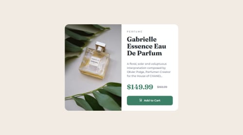
Product preview card with Sass and responsive images

sass/scss
sofiasmnk•110
@sofiasmnk
A solution to the Product preview card component challenge
View live sitePreview (opens in new tab)View codeCode (opens in new tab)

Solution retrospective


What are you most proud of, and what would you do differently next time?

This one was so much fun!! I'd looked into Sass before, but hadn't really styled anything beyond very simple, small exercises with it. Doing this whole challenge with Sass was fun, and I'm proud of managing to organize my Sass code using partials. Also, last time there was a challenge to make font-size responsive without media queries, I used the "clamp" method with a size in just vw in the middle, and later found out this is bad for accessibility because it doesn't allow the user to resize the text easily. This time I generated typography scale in Utopia to use instead!

I'm still not very confident about working with responsive images in HTML, though. I followed the MDN guide on responsive images to get through the challenge, but just adding media="(max-width: 30rem)" and media="(min-width: 30.01rem)" to the source elements, it feels hacky and magic-number-y... but I needed the images to switch at the same time as my layout between 1 and 2 columns, and I couldn't think of another way to do it. I also... don't fully understand how it works when you use srcset and specify a width or pixel density for each image.

What challenges did you encounter, and how did you overcome them?

I had a really hard time getting the image height to adapt to the card content height in the 2-column layout. I knew it would be easy if I set the image as the background of an empty div, but this image was part of the content and seemed like it should be an actual element... I tried a lot of stuff and then searched around a lot too, and in the end finally found something that worked! I had to set the parent to position: relative, the img to position: absolute, and both to width: 100%; height: 100%;. Not sure if there's another, better way to achieve this, but at least this worked!

What specific areas of your project would you like help with?

I would appreciate hints on responsive images with multiple sources, because even after reading the articles listed here on Frontend Mentor I was still pretty confused.

Code
Select a file

Please log in to post a comment

Log in with GitHub

Community feedback

  • Andre•50
    @dreemanuel
    Posted 8 months ago

    Good job!

    There is a little kink in the breakpoint settings: the end dimensions is smaller than the dimensions when the screen is shrunk down before it.

    I think I'm bad at explaining it, but as I'm expanding the screen size from the mobile, vertical layout, after it switches to the desktop layout (with the image on the left side of the card), the card size stretches on and on, until it reaches the final breakpoint and it then shrinks.

Join our Discord community

Join thousands of Frontend Mentor community members taking the challenges, sharing resources, helping each other, and chatting about all things front-end!

Join our Discord
Frontend Mentor logo

Stay up to datewith new challenges, featured solutions, selected articles, and our latest news

Frontend Mentor

  • Unlock Pro
  • Contact us
  • FAQs
  • Become a partner

Explore

  • Learning paths
  • Challenges
  • Solutions
  • Articles

Community

  • Discord
  • Guidelines

For companies

  • Hire developers
  • Train developers
© Frontend Mentor 2019 - 2025
  • Terms
  • Cookie Policy
  • Privacy Policy
  • License

Oops! 😬

You need to be logged in before you can do that.

Log in with GitHub

Oops! 😬

You need to be logged in before you can do that.

Log in with GitHub

How does the accessibility report work?

When a solution is submitted, we use axe-core to run an automated audit of your code.

This picks out common accessibility issues like not using semantic HTML and not having proper heading hierarchies, among others.

This automated audit is fairly surface level, so we encourage to you review the project and code in more detail with accessibility best practices in mind.

How does the CSS report work?

When a solution is submitted, we use stylelint to run an automated check on the CSS code.

We've added some of our own linting rules based on recommended best practices. These rules are prefixed with frontend-mentor/ which you'll see at the top of each issue in the report.

The report will audit all CSS, SCSS and Less files in your repository.

How does the HTML validation report work?

When a solution is submitted, we use html-validate to run an automated check on the HTML code.

The report picks out common HTML issues such as not using headings within section elements and incorrect nesting of elements, among others.

Note that the report can pick up “invalid” attributes, which some frameworks automatically add to the HTML. These attributes are crucial for how the frameworks function, although they’re technically not valid HTML. As such, some projects can show up with many HTML validation errors, which are benign and are a necessary part of the framework.

How does the JavaScript validation report work?

When a solution is submitted, we use eslint to run an automated check on the JavaScript code.

The report picks out common JavaScript issues such as not using semicolons and using var instead of let or const, among others.

The report will audit all JS and JSX files in your repository. We currently do not support Typescript or other frontend frameworks.

Oops! 😬

You need to be logged in before you can do that.

Log in with GitHub