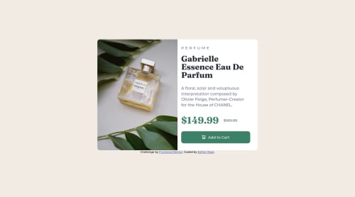
Submitted over 2 years agoA solution to the Product preview card component challenge
Product Preview Component - Media Queries for Desktop & Mobile

@codarose
Solution retrospective
Is there a better way to get the image to scale in the desktop view than using "object-fit: cover" ?
Is there a way other than media queries to use two separate images for desktop and mobile?
Code
Loading...
Please log in to post a comment
Log in with GitHubCommunity feedback
No feedback yet. Be the first to give feedback on Esther Rose's solution.
Join our Discord community
Join thousands of Frontend Mentor community members taking the challenges, sharing resources, helping each other, and chatting about all things front-end!
Join our Discord