Product Preview Component

Solution retrospective
Feedback is welcomed!
Please log in to post a comment
Log in with GitHubCommunity feedback
- @correlucas
👾Hello @suhaib52, Congratulations on completing this challenge!
Your solution its almost done and I’ve some tips to help you to improve it:
Using
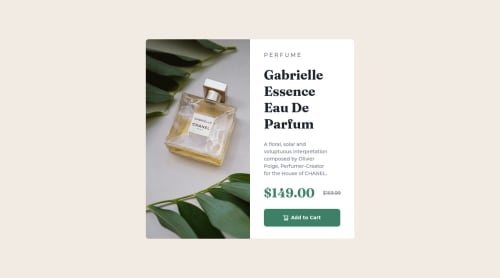
<picture>you’ve more control over the elements and its better than using the product image as<img>orbackground-image. Look that for SEO and search engine reasons it isn't a better practice to import this product image with CSS since this will make it harder to the image. You can manage both images inside the<picture>tag and use the html to code to set when the images should change setting the devicemax-widthdepending of the device (phone / computer) Here’s a guide about how to usepicture:https://www.w3schools.com/tags/tag_picture.aspSee the example below:
<picture>
  <source media="(max-width:650px)" srcset="./images/image-product-mobile.jpg">
  <img src="./images/image-product-desktop.jpg" alt="Gabrielle Parfum" style="width:auto;">
</picture>
✌️ I hope this helps you and happy coding!

Join our Discord community
Join thousands of Frontend Mentor community members taking the challenges, sharing resources, helping each other, and chatting about all things front-end!
Join our Discord