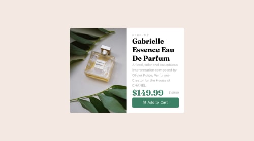
Product Preview Component using plain HTML

Solution retrospective
Difficulties:
- I didn't find anything too difficult for this project.
Areas of unsureness:
- I'm unsure with font sizes for both desktop and mobile versions.
- I tried incorporating class names for often for this.
Best Practices:
- Naming conventions
- File structure
- The use of percentages for measurement
Please log in to post a comment
Log in with GitHubCommunity feedback
- P@visualdenniss
Good work!
Regarding font-sizes, they look a bit too big, you can make them smaller and give more breathing-space between them like in the design.
Also try to avoid using px as much as you can, instead try to use em or rem to improve accessibility. Here is a great resource on YT for that: https://www.youtube.com/watch?v=dHbYcAncAgQ
Finally, i'd suggest changing background of the button on hover to indicate users about the interactivity even more.
Hope you find this feedback helpful!
Marked as helpful
Join our Discord community
Join thousands of Frontend Mentor community members taking the challenges, sharing resources, helping each other, and chatting about all things front-end!
Join our Discord