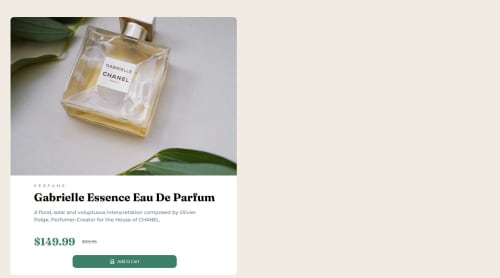
Product-preview

Solution retrospective
I am proud of being able to use Sass in this project. I will try to make my code neater next time.
What challenges did you encounter, and how did you overcome them?I didn't make the page responsive. I have tried to use mobile first approach, but after that I don't know what I should do set rules for bigger screen. I notice that I should use calc() but I don't know if I should write it in mobile part only or for both part. Can those who have experience in implementing responsive pages give me some advice or feedback. Thank you!
What specific areas of your project would you like help with?Calc(). After mobile screen css has defined, How to make use @media (min-width: 1024px) {}. Do we need to re-write most of parts? or is there better way to do it? Before we write css, do we need to reset the html tag every time? I usually have a main tag and a container div to wrap around all of the content. Is that a good practice or not ? Thanks
Please log in to post a comment
Log in with GitHubCommunity feedback
No feedback yet. Be the first to give feedback on HoaCTa's solution.
Join our Discord community
Join thousands of Frontend Mentor community members taking the challenges, sharing resources, helping each other, and chatting about all things front-end!
Join our Discord