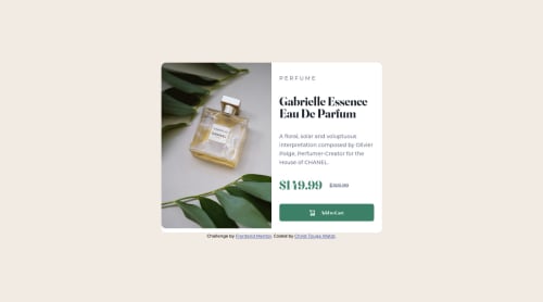
Submitted about 3 years agoA solution to the Product preview card component challenge
product preview using HTML, CSS flexbox and advanced selectors

@Christ-Kevin
Solution retrospective
I don't have a particular question on this project but I would be grateful for any suggestions that can make me improve my coding skills
Code
Please log in to post a comment
Log in with GitHubCommunity feedback
- @AlexKMarshall
This is looking very good, there's just a few things that would be worth taking a look at
The add to cart button:
- you've used a div wrapping an anchor tag that has the add to cart text in it. So, while the hover effect covers the whole div, the clickable target doesn't. A user would only be able to click on the text.
- this should really be a button. In html anchors are navigating to another location, and buttons are for executing some other action like a form submission or triggering some javascript. Here adding to cart is an action, not a navigation
The perfume ribbon text:
- You've written
P E R F U M Edirectly in the html. A screen-reader will read that as individual letters, not a word - Instead, write
Perfumein the html, and then use csstext-transformandletter-spacingproperties to style it like the design
The prices section:
- You've used flexbox here, but have had to use 4 non-breaking spaces to create the gap between the prices
- use
gapinstead for more flexibility - In addition, on very tiny screens, or high zoom levels, you get overflow here. To avoid that add
flex-wrap: wrapso it can wrap onto a new line if there's not enough space for it to fit in one line
The image:
- this is part of the product card, so should go inside
<main> - you've used
object-fit: fill, so at a couple of screen-sizes the image stretches out of its aspect-ratio. To avoid that useobject-fit: cover
In general though these are mostly fairly minor points that are easily fixed.
Well done for making it very responsive, avoiding almost all overflow, writing good alt text for the image
Marked as helpful

Join our Discord community
Join thousands of Frontend Mentor community members taking the challenges, sharing resources, helping each other, and chatting about all things front-end!
Join our Discord