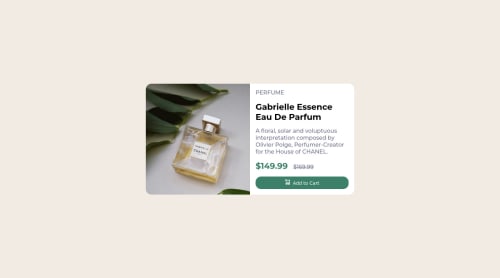
Submitted about 3 years agoA solution to the Product preview card component challenge
Product preview with grid and flex

@Emmiecodes
Solution retrospective
Feedback on how to remain proper scaling of the container when zooming out would be welcome. (See css file for the problem I had). When I used flex instead of grid, I could not get both divs within the container to be 50/50 in width even after setting 100% on both.
I'm also not entirely sure if the mobile view is good. When I first view mobile view with the emulation mode, it looks bad, but when I get back to desktop view, and then again back to mobile view, it looks well fitted to the screen size.
Code
Loading...
Please log in to post a comment
Log in with GitHubCommunity feedback
No feedback yet. Be the first to give feedback on Emmiecodes's solution.
Join our Discord community
Join thousands of Frontend Mentor community members taking the challenges, sharing resources, helping each other, and chatting about all things front-end!
Join our Discord