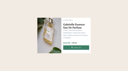
product-preview-card-component using flex-box

Solution retrospective
I need advice to be able to better manage images. Which css properties is best to use?
Please log in to post a comment
Log in with GitHubCommunity feedback
- @savvystrider
I'd recommend using the
object-fitCSS property: https://developer.mozilla.org/en-US/docs/Web/CSS/object-fit to handle images. - P@visualdenniss
Hey there,
nice work.
-
Remove heights from .card-container height: 50%; and height: 80%, instead use max-width: 600px, then children should have width of 50% (picture and the right side), image should have height: 100%. If it gets distorted for some reason, you can always use object-fit: cover; to fix.
-
In general regarding best practices, i'd suggest to avoid giving fixed heights or max-heights for text containing elements like you have for .container, even if it is in rem, because it can cause issues later on (with changing dynamic data, when the user changes font-sizes, or even browser rendering issues etc.). The height should be determined by the content of the elements inside the container + paddings + margins.
-
Font families are not displayed because you have not imported them, simply add this on top of your css file:
-
@import url('https://fonts.googleapis.com/css2?family=Fraunces:opsz,wght@9..144,700&family=Montserrat:wght@500;700&display=swap');
Hope you find this feedback helpful!
-


Join our Discord community
Join thousands of Frontend Mentor community members taking the challenges, sharing resources, helping each other, and chatting about all things front-end!
Join our Discord