


Fer• 3,990
@fernandolapaz
Posted
Hi 👋, perhaps some of this may interest you:
HTML 🧱, ACCESSIBILITY ⚖:
- To show different images depending on the device or screen size, the
<picture>element is ideal:
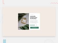
<picture>
<source media="(min-width: 600px)" srcset="images/image-product-desktop.jpg">
<img src="images/image-product-mobile.jpg" alt="description">
</picture>
- The image of the perfume is a meaningful image and in case the user can't see it, the
alttext should give a description. On the other hand, the icon is a decorative image and needs an emptyaltattribute so a screen reader will ignore it.
CSS 🎨:
- It is better to use
min-height: 100vh;for the body, as usingheightcauses the page to be cut off in viewports with small height (such as mobile landscape orientation). Also, there's no need to set a width to 100%, as block elements are full width by default.
- You might consider using relative units like rem for
font-sizetoo, since they are better for scalable layouts.
- It might be good to get used to designing with the mobile first approach, which means designing for mobile first and then for desktop or any other device, as it is widely considered best practice.
Please let me know if you want more info on any of these topics or disagree with something. I hope it’s useful 🙂
Regards,
0

