Skip to content
  • Unlock Pro
  • Log in with GitHub
Solution
Submitted almost 3 years ago

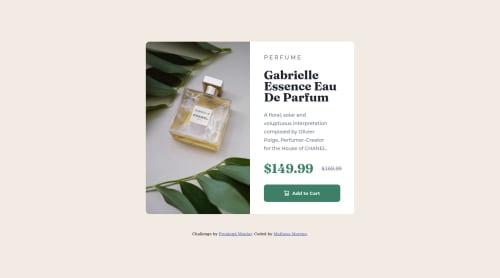
product-preview-card-component-main with css flex, sass

sass/scss
Matheus Moreno•220
@matheusmorenocf
A solution to the Product preview card component challenge
View live sitePreview (opens in new tab)View codeCode (opens in new tab)

Solution retrospective


At first I put the product image in the html, but due to the responsiveness I realized that it would be easier to use the product as a background image so I could change it only with the css when the screen shrinks.

I saw some tips in my last challenge, they said to use rem or em instead of px, is there any way to convert more easily?

I stop using px in places like width and height too?

I appreciate any tips that can help me.

Code
Select a file

Please log in to post a comment

Log in with GitHub

Community feedback

  • Lucas 👾•104,160
    @correlucas
    Posted almost 3 years ago

    👾Hello @matheusmorenocf, Congratulations on completing this challenge!

    Your solution its almost done and I’ve some tips to help you to improve it:

    I saw that for some properties you’ve used rem and for others px. In this case, it is better to use only one kind of unit to have a better organization for your code. relative units as rem or em have a better fit if you want your site more accessible between different screen sizes and devices. REM and EM does not just apply to font size, but to all sizes as well.

    THE PICTURE TAG is a shortcut to deal with the multiple images in this challenge. So you can use the <picture> tag instead of importing this as an <img> or using a div with background-image. Use it to place the images and make the change between mobile and desktop, instead of using a div or img and set the change in the css with display: none with the tag picture is more practical and easy. Note that for SEO / search engine reasons isn’t a better practice import this product image with CSS since this will make it harder to the image. Manage both images inside the <picture> tag and use the html to code to set when the images should change setting the device max-width depending of the device desktop + mobile.

    Check the link for the official documentation for <picture> in W3 SCHOOLS: https://www.w3schools.com/tags/tag_picture.asp

    ✌️ I hope this helps you and happy coding!

  • Austin•160
    @Ausranking
    Posted almost 3 years ago

    Work well done @matheusmorenocf in your body style, I saw min-width:600px width:30% I suggest it better be max-width: 600px or width: 600px I suggest you include more semantics in your HTML such as "article" , "aside" and minimize the use of divs Good Job!

Join our Discord community

Join thousands of Frontend Mentor community members taking the challenges, sharing resources, helping each other, and chatting about all things front-end!

Join our Discord

Stay up to datewith new challenges, featured solutions, selected articles, and our latest news

Frontend Mentor

  • Unlock Pro
  • Contact us
  • FAQs
  • Become a partner

Explore

  • Learning paths
  • Challenges
  • Solutions
  • Articles

Community

  • Discord
  • Guidelines

For companies

  • Hire developers
  • Train developers
© Frontend Mentor 2019 - 2025
  • Terms
  • Cookie Policy
  • Privacy Policy
  • License

Oops! 😬

You need to be logged in before you can do that.

Log in with GitHub

Oops! 😬

You need to be logged in before you can do that.

Log in with GitHub

How does the accessibility report work?

When a solution is submitted, we use axe-core to run an automated audit of your code.

This picks out common accessibility issues like not using semantic HTML and not having proper heading hierarchies, among others.

This automated audit is fairly surface level, so we encourage to you review the project and code in more detail with accessibility best practices in mind.

How does the CSS report work?

When a solution is submitted, we use stylelint to run an automated check on the CSS code.

We've added some of our own linting rules based on recommended best practices. These rules are prefixed with frontend-mentor/ which you'll see at the top of each issue in the report.

The report will audit all CSS, SCSS and Less files in your repository.

How does the HTML validation report work?

When a solution is submitted, we use html-validate to run an automated check on the HTML code.

The report picks out common HTML issues such as not using headings within section elements and incorrect nesting of elements, among others.

Note that the report can pick up “invalid” attributes, which some frameworks automatically add to the HTML. These attributes are crucial for how the frameworks function, although they’re technically not valid HTML. As such, some projects can show up with many HTML validation errors, which are benign and are a necessary part of the framework.

How does the JavaScript validation report work?

When a solution is submitted, we use eslint to run an automated check on the JavaScript code.

The report picks out common JavaScript issues such as not using semicolons and using var instead of let or const, among others.

The report will audit all JS and JSX files in your repository. We currently do not support Typescript or other frontend frameworks.

Oops! 😬

You need to be logged in before you can do that.

Log in with GitHub

Oops! 😬

You need to be logged in before you can do that.

Log in with GitHub