Skip to content
  • Unlock Pro
  • Log in with GitHub
Solution
Submitted about 2 years ago

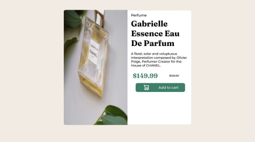
product-preview-card-component-main with HTML and CSS

emotion, web-components, materialize-css
Vinicius Calefo Assarice•30
@viniciuscalefo
A solution to the Product preview card component challenge
View live sitePreview (opens in new tab)View codeCode (opens in new tab)

Solution retrospective


Use the concept of mobile first, and i don´t know why isn`t working because when a finish the desktop version the mobile wasn´t working

Code
Select a file

Please log in to post a comment

Log in with GitHub

Community feedback

  • Tushar Biswas•4,060
    @itush
    Posted about 2 years ago

    Congratulations on completing the challenge! 🎉

    Nice attempt:)

    • Feel free to go through my product preview project code and notice how I handle responsiveness with mobile and desktop product images.

    • To make it mobile responsive it is important to first understand how different breakpoints work with the media queries, which breakpoints to target, how to apply different styling to the same element at different breakpoints etc.

    • Looking at the designs, you need to decide for how many breakpoints you wish to modify the same layout and add media queries accordingly.

    • Designs only change at defined media query breakpoints. We have two options... either we can target a breakpoint apply some changes for that breakpoint and up screens or the same breakpoint and down screens.

    • For example, If you want to make the body blue @600px then you also need to decide whether the body remains blue on 600px and up screens or 600px and down screens. If you decide to maintain a blue background for 600px and up screens you'd use @media only screen and (min-width: 600px) {...} and @media only screen and (max-width: 600px) {...} for the opposite scenario. And lets say @500px you want a red background and @700px you need a yellow background, then you need to follow the same drill.

    • Please note: There are tons of screens and devices with different heights and widths, so it is hard to create an exact breakpoint for each device. To keep things simple we target the typical five groups of breakpoints. However, You can add as many breakpoints as you like to make it more responsive.

    • In my CSS article that I previously shared with you I have discussed media queries, mobile-first workflow etc. was that any good for you? was it easy enough to understand the concepts? please let me know whenever you can :)

    Please feel free to ask more questions👍

    Happy hacking🚀💻

    Marked as helpful

Join our Discord community

Join thousands of Frontend Mentor community members taking the challenges, sharing resources, helping each other, and chatting about all things front-end!

Join our Discord

Stay up to datewith new challenges, featured solutions, selected articles, and our latest news

Frontend Mentor

  • Unlock Pro
  • Contact us
  • FAQs
  • Become a partner

Explore

  • Learning paths
  • Challenges
  • Solutions
  • Articles

Community

  • Discord
  • Guidelines

For companies

  • Hire developers
  • Train developers
© Frontend Mentor 2019 - 2025
  • Terms
  • Cookie Policy
  • Privacy Policy
  • License

Oops! 😬

You need to be logged in before you can do that.

Log in with GitHub

Oops! 😬

You need to be logged in before you can do that.

Log in with GitHub

How does the accessibility report work?

When a solution is submitted, we use axe-core to run an automated audit of your code.

This picks out common accessibility issues like not using semantic HTML and not having proper heading hierarchies, among others.

This automated audit is fairly surface level, so we encourage to you review the project and code in more detail with accessibility best practices in mind.

How does the CSS report work?

When a solution is submitted, we use stylelint to run an automated check on the CSS code.

We've added some of our own linting rules based on recommended best practices. These rules are prefixed with frontend-mentor/ which you'll see at the top of each issue in the report.

The report will audit all CSS, SCSS and Less files in your repository.

How does the HTML validation report work?

When a solution is submitted, we use html-validate to run an automated check on the HTML code.

The report picks out common HTML issues such as not using headings within section elements and incorrect nesting of elements, among others.

Note that the report can pick up “invalid” attributes, which some frameworks automatically add to the HTML. These attributes are crucial for how the frameworks function, although they’re technically not valid HTML. As such, some projects can show up with many HTML validation errors, which are benign and are a necessary part of the framework.

How does the JavaScript validation report work?

When a solution is submitted, we use eslint to run an automated check on the JavaScript code.

The report picks out common JavaScript issues such as not using semicolons and using var instead of let or const, among others.

The report will audit all JS and JSX files in your repository. We currently do not support Typescript or other frontend frameworks.

Oops! 😬

You need to be logged in before you can do that.

Log in with GitHub