Skip to content
  • Unlock Pro
  • Log in with GitHub
Solution
Submitted over 2 years ago

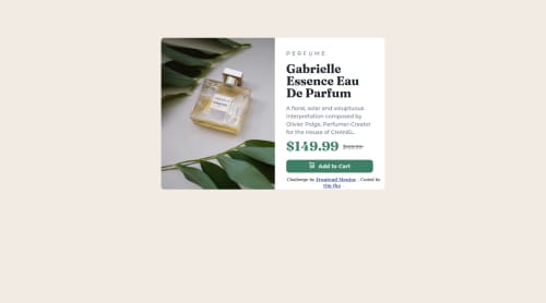
Product-view-card-component with just CSS and HTML

cube-css, materialize-css, tailwind-css
Om Jha•20
@blzee-maker
A solution to the Product preview card component challenge
View live sitePreview (opens in new tab)View codeCode (opens in new tab)

Solution retrospective


  1. How can make a site be more Responsive to multiple devices? what is a must to know for Responsive sites?

  2. I think the code I have provided is a little complex. what can be a much simpler option that satisfies all the required needs?

  3. What else can be done to cross the perfume's MRP value(169.99)? Aside from using the hr tag.

Code
Select a file

Please log in to post a comment

Log in with GitHub

Community feedback

  • P
    Atif Iqbal•3,320
    @atif-dev
    Posted over 2 years ago

    Hi, for responsiveness you need to learn CSS flexbox or CSS Grid. Or you can learn responsiveness in this short course that is completely free(https://courses.kevinpowell.co/conquering-responsive-layouts) For crossing text, you can use s tag like <s>$169.99</s> or you can use text-decoration: line-through in your CSS code. If you don't know about responsiveness, it will take time to learn and make things simple.😇👍

    Marked as helpful
  • Tomek•240
    @qntek
    Posted over 2 years ago

    To make your page more responsive for all devices read about media queries: https://developer.mozilla.org/en-US/docs/Web/CSS/Media_Queries/Using_media_queries

    To style your page, good practice is to have separate file for css styling with you can import in head tag section, for example: <link rel="stylesheet" href="./papth-to-your-css-file.css">

    To corss the perfume's value You shall use: text-decoration: line-through;

    Marked as helpful
  • Adriano•42,890
    @AdrianoEscarabote
    Posted over 2 years ago

    Hi Om Jha, how are you? Welcome to the front-end mentor community! I really liked the result of your project, but I have some tips that I think you will enjoy:

    To align some content in the center of the screen, always prefer to use display: flex; it will make the layout more responsive!

    Example:

    body {
        margin: 0;
        padding: 0;
        display: flex;
        align-items: center;
        flex-direction: column;
        justify-content: center;
        min-height: 100vh;
    }
    

    avoid using px, If your web content font sizes are set to absolute units, such as pixels, the user will not be able to re-size the text or control the font size based on their needs. if you want to keep using px for development and then format the whole code to rem, you can use this vscode extension: px to rem

    The rest is great!

    I hope it helps... 👍

  • CyPhEr420•400
    @CyPhEr420
    Posted over 2 years ago

    use flexbox it will make your code simple you will not have to use margin so much. Try looking at other people's code and try to figure out what they r doing

Join our Discord community

Join thousands of Frontend Mentor community members taking the challenges, sharing resources, helping each other, and chatting about all things front-end!

Join our Discord

Stay up to datewith new challenges, featured solutions, selected articles, and our latest news

Frontend Mentor

  • Unlock Pro
  • Contact us
  • FAQs
  • Become a partner

Explore

  • Learning paths
  • Challenges
  • Solutions
  • Articles

Community

  • Discord
  • Guidelines

For companies

  • Hire developers
  • Train developers
© Frontend Mentor 2019 - 2025
  • Terms
  • Cookie Policy
  • Privacy Policy
  • License

Oops! 😬

You need to be logged in before you can do that.

Log in with GitHub

Oops! 😬

You need to be logged in before you can do that.

Log in with GitHub

How does the accessibility report work?

When a solution is submitted, we use axe-core to run an automated audit of your code.

This picks out common accessibility issues like not using semantic HTML and not having proper heading hierarchies, among others.

This automated audit is fairly surface level, so we encourage to you review the project and code in more detail with accessibility best practices in mind.

How does the CSS report work?

When a solution is submitted, we use stylelint to run an automated check on the CSS code.

We've added some of our own linting rules based on recommended best practices. These rules are prefixed with frontend-mentor/ which you'll see at the top of each issue in the report.

The report will audit all CSS, SCSS and Less files in your repository.

How does the HTML validation report work?

When a solution is submitted, we use html-validate to run an automated check on the HTML code.

The report picks out common HTML issues such as not using headings within section elements and incorrect nesting of elements, among others.

Note that the report can pick up “invalid” attributes, which some frameworks automatically add to the HTML. These attributes are crucial for how the frameworks function, although they’re technically not valid HTML. As such, some projects can show up with many HTML validation errors, which are benign and are a necessary part of the framework.

How does the JavaScript validation report work?

When a solution is submitted, we use eslint to run an automated check on the JavaScript code.

The report picks out common JavaScript issues such as not using semicolons and using var instead of let or const, among others.

The report will audit all JS and JSX files in your repository. We currently do not support Typescript or other frontend frameworks.

Oops! 😬

You need to be logged in before you can do that.

Log in with GitHub

Oops! 😬

You need to be logged in before you can do that.

Log in with GitHub

Oops! 😬

You need to be logged in before you can do that.

Log in with GitHub

Oops! 😬

You need to be logged in before you can do that.

Log in with GitHub