Not Found
Not Found
Not Found
Not Found
Not Found
Not Found
Not Found
Not Found
Not Found
Not Found
Not Found
Not Found
Not Found
Not Found
Not Found
Not Found
Not Found
Not Found
Not Found
Not Found

Submitted

profile card component

@Igwe0001

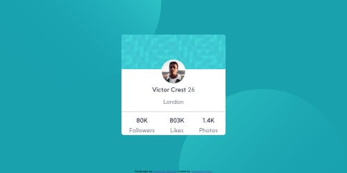
Desktop design screenshot for the Profile card component coding challenge

This is a solution for...

  • HTML
  • CSS
1newbie
View challenge

Design comparison


SolutionDesign

Solution retrospective


Hi, please provide feedback and tell me how i can improve, your reviews are highly welcomed, thank you.

Community feedback

P
Grace 27,710

@grace-snow

Posted

Hi Nwobodo,

I love seeing this kind of thread where someone's suggested stuff and you've taken it on board and made changes. Well done thats great to see!

Looking at your html, it's invalid at the moment because you have <p> tags directly inside a <ul>. That's dead easy to fix though, just swap the paragraphs for <li>s instead (no paragraphs needed)

Only other thing I spot from. Glancing at the result is you need a little more padding / whitespace at the bottom of the card so it looks more like the design.

Well done on this

0

@Igwe0001

Posted

@grace-snow Hi, made the changes thanks for your comment on my work, I really appreciate it.

1
P
Katrien S 1,070

@graficdoctor

Posted

Hey, I just finished the exact same exercise so was checking yours to see how you handled it. Can I ask you why you put everything in media-queries? Your page jumps when I resize the page-size. The font strangely didn't load. And there is a lot of repeated code and a lot of unnecessary media-queries. Could you clean up your code? Start writing thinking mobile-first but without adding the media-query. Because this <meta name="viewport" content="width=device-width, initial-scale=1.0" /> is in your html, your webpage is already responsive. This exercise can be solved without any media-query. Best practice here is put everything in a div class="container"give the container in your css a max-width (350px) and a width='85%' and the component will be ok when resizing the page. In css it's very easy to write tons of code. The key is to reach the same effect, with as little as code as possible. Reach out if you have any questions. Happy coding!

0

@Igwe0001

Posted

@graficdoctor Hi I made some changes to it, I would really like you to look into it and tell me what you think, thanks for your input it really helped me. OH and I used your body calc function, still have to learn that too, thanks, waiting for your reply.

0
P
Katrien S 1,070

@graficdoctor

Posted

@Igwe0001 Amazing the difference to yesterday's code! It looks fab. Maybe take of the background-size on your body? Because it is in pixels, it is a fixed value and stops your site from looking nice on screens bigger then 700px. So I don't think you need it. But I like what you did! Nice one!

0

@Igwe0001

Posted

@graficdoctor Done that. Thanks again for your input.

0

Please log in to post a comment

Log in with GitHub
Discord logo

Join our Discord community

Join thousands of Frontend Mentor community members taking the challenges, sharing resources, helping each other, and chatting about all things front-end!

Join our Discord