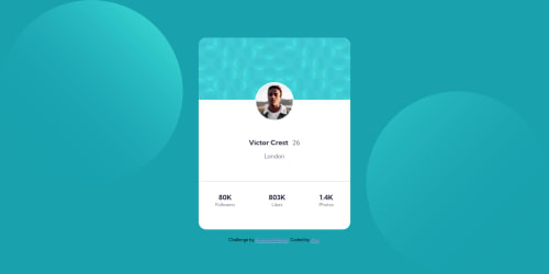
Profile card component challenge hub

Solution retrospective
Hey everyone !
With this projet, I realize that I wasn't good enough in responsive design.
So I'll reread doc for it, but if you have any site where I can learn some tips, feel free to send it !
Have a good one !
Please log in to post a comment
Log in with GitHubCommunity feedback
- @Da-vi-de
Hi, i've been there so i know the struggle! I suggest you to follow one of the best instructor, Kevin Powell, here is the link to one of his free videos where he explains clearly the main concept of mobile first approach! You can start from there, for more insight about it or any other subject you can also follow FEM slack channels where you can learn more from the community!
- The result is not bad but i'm sure it will be nice after making it full responsive. My tip is, if you don't work with you dev tool open, start asap. In order to do that you need to open the dev tool by right clicking the mouse and select inspect and then click the two mobiles icon on the right, set the width to 350px, start from there, once you're done start adding media queries when you see your UI changes like so
@media all and (min-width: ...) { }Keep in mind that you need to make a decent/good/as perfect as you can job for three main devices: mobile, tablet, desktop.
Hope it helps a little, keep coding :-)
- The result is not bad but i'm sure it will be nice after making it full responsive. My tip is, if you don't work with you dev tool open, start asap. In order to do that you need to open the dev tool by right clicking the mouse and select inspect and then click the two mobiles icon on the right, set the width to 350px, start from there, once you're done start adding media queries when you see your UI changes like so
- @kens-visuals
Hey @AlanBoulesteix 👋🏻
I have some quick tips on how to fix the accessibility and HTML issue.
- In your markup,
<div class="container">...</div>should be<main class="container">...</main>and<div class="attribution">...</div>should be<footer class="attribution">...</footer>. These will fix the accessibility issues. - Next, please make sure to add
altto your images. Here, this is a great article that will teach the subtle art of writingalttags 🙃
Don't forget to generate a new repot once you fix the issues.
I hope this was helpful 👨🏻💻 and to answer your question about responsive design, I'd suggest taking this free 21-day course, by Kevin Powell. The format of the course is unique, and it helps a lot. This is the course that helped me to gain all the fundamental knowledge about responsive development, and add to that a bit of daily practice, and you'll see the results 👌🏻 That's it from me, cheers 👾
- In your markup,


Join our Discord community
Join thousands of Frontend Mentor community members taking the challenges, sharing resources, helping each other, and chatting about all things front-end!
Join our Discord