


Hi Arjen
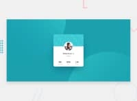
This looks pretty good overall but I can see some white at the top of the card on mobile, and some of the text is unreadably small for me.
Here are some suggestions to improve your code
- look up how and when to write alt attribute values on images. This needs real improvement
- always use semantic elements. What would be better for those 3 stats? A description list, unordered list, table etc? There is always a better element for text content than div/span
- you don’t need a height on the card. Let it’s height be dictated by the size of content plus the paddings and margins inside
- instead of having a media query why not just set the card to be 100% width and give it a max width in REM?
- be careful not to increase css specificity unnecessarily. Single class selectors will be much easier to maintain.
Good luck
Marked as helpful
1
P
Arjen Combee• 50
@ArCombee
Posted
@grace-snow Hello Grace,
Thank you so much for taking the time to give me your feedback. I really appreciate this. You're right with the bullet points and I did some refactoring work 😀.
- Used CSS grid for the card framework
- Changed the statistics list into an unordered list
- Removed the background image, but I'm not happy yet with the empty DIV solution I came up with.
- The media Query is still in though 😮. I'll need it because the shadow on mobile is different.
- Fixed the profile image width, didn't know that border is “subtracted” from the image. Even is box-sizing is set to border-box. The use of outline gives a bleed trough of the background.
Think this second version is better, and will improve it in the future.
Best regards,
Arjen
0
