


@jeurysantos1
Posted
Hey Tati.
I loved Sass as well, and I am glad you used it. I like the organization of your environment (everything on its own on file).
Easy to read= easy to maintaining; Those are hard to accomplish, and you killed it.
Something that I didn't see the design wasn't responsive to a cellphone viewport of the 375px. In the future trying to use more Media queries, so you modify your design to the viewport required.
And How you get to have so much perfect preview ??
@tatimunizz
Posted
@jeurysantos1 Hi Jeury! Thank you for your kind comment!
I did not approach the mobile view in this challenge. I was afraid of it hahahah But I am researching about it, and how to do it in a good way. Some people have told me that I should approach the mobile view first thing, but for some reason I keep not doing that. I will do it in the next challenge.
About the preview:
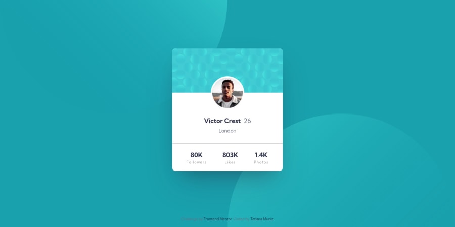
I try to stick to the proportion of the design. I do not have the Pro account so, to get close to the sizes and proportions I place the design images (that are exactly the size of the large computer screen size and the mobile screen size) in the Figma. In this way I can trace and reproduce all the elements in the design. Figma is great because it gives css code. So I know the box sizes, the text size, even the line height, which font weight to use and many other aspects. Sure it is not precise as to have all the design documentation in hand, but it is quite close to the original design. And I enjoy the process of retracing the elements and practicing this skill as well.
I hope I answered your question.
Have a good day!
@jeurysantos1
Posted
@tatimunizz Oh Waoo every day we learned something new. thank you so much for your help I didn't know such a powerful site exists but thank

