Not Found
Not Found
Not Found
Not Found
Not Found
Not Found
Not Found
Not Found
Not Found
Not Found
Not Found
Not Found
Not Found
Not Found
Not Found
Not Found
Not Found
Not Found
Not Found
Not Found

Submitted

Profile card using Flexbox

Stacey 30

@staceysav

Desktop design screenshot for the Profile card component coding challenge

This is a solution for...

  • HTML
  • CSS
1newbie
View challenge

Design comparison


SolutionDesign

Solution retrospective


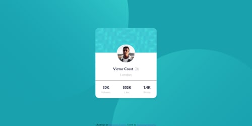
I finished my second challenge and looking forward to feedback 🙌 Any comment is valuable. I struggled with creating background for some time, couldn't position the circles inside the screen div and make them partially "leave" the screen. Now, when I change the screen size to mobile, the circles move. How can I make them stay in place? What are better practices for adding the blue picture (which is above the profile photo) to the card?

Community feedback

Vanza Setia 27,855

@vanzasetia

Posted

Hi, Stacey! 👋

Positioning those circles is indeed a tricky thing to do. But, it is possible to do it. So, I recommend making those circles as background images of the body element instead. Then, you can use viewport units or even clamp() function to position them dynamically according to the user's screen size. I recommend taking a look at the ApplePieGiraffe's solution for this challenge as an inspiration.

For the bg-pattern-card.svg, I made it as an img element. It's because if I set it as a background image, I have to do a lot more work like specifying the height of it, setting the background repetition, etc. Also, since it is a decorative image, I left the alt="" empty so that screenreader users won't have to listen to the decorative elements.

I hope this answer your questions!

Marked as helpful

1
Adriano 34,000

@AdrianoEscarabote

Posted

Hi Stacey, how are you?

You did a good job again, I found the way you positioned the background images very interesting. I remember that I had a hard time positioning the two circles, I spent a few minutes on goolge looking for some useful article hahahahah

I have two tips that I think you will like:

1- Document should have one main landmark, you could have put all the content inside the main tag click here

2- Page should contain a level-one heading. click here

The rest is all very good! hope it helps 👍

1

Stacey 30

@staceysav

Posted

@AdrianoEscarabote Hey Adriano, thanks for the comment! These are my two common mistakes 😅 I'll try to remember and avoid them.

1
Adriano 34,000

@AdrianoEscarabote

Posted

@staceysav it was my problem too ahahahahah

0

Please log in to post a comment

Log in with GitHub
Discord logo

Join our Discord community

Join thousands of Frontend Mentor community members taking the challenges, sharing resources, helping each other, and chatting about all things front-end!

Join our Discord