Submitted almost 5 years agoA solution to the Profile card component challenge
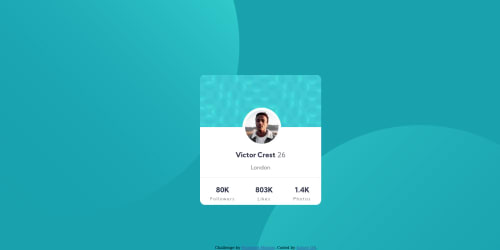
Profile Card with BEM & SASS

@SamyrOR
Solution retrospective
Hi everybody!
I'm new here and praticing some front-end knowledge.
Will be a pleasure recive all feedback i can!
How it could been mobile fisrt?
Code
Loading...
Please log in to post a comment
Log in with GitHubCommunity feedback
No feedback yet. Be the first to give feedback on Samyr Oliveira Ribeiro's solution.
Join our Discord community
Join thousands of Frontend Mentor community members taking the challenges, sharing resources, helping each other, and chatting about all things front-end!
Join our Discord