Skip to content
  • Unlock Pro
  • Log in with GitHub
Solution
Submitted over 3 years ago

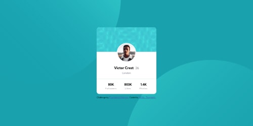
Profile Card with HTML, CSS & Flexbox

Wild_Tsunami•120
@WildTsunami
A solution to the Profile card component challenge
View live sitePreview (opens in new tab)View codeCode (opens in new tab)

Solution retrospective


A bit harder than expected. I have some issues with the background images, I don't know how to "fix" it because this way it follows the screen and with the mobile view it's not good.

Code
Select a file

Please log in to post a comment

Log in with GitHub

Community feedback

  • Raymart Pamplona•16,040
    @pikapikamart
    Posted over 3 years ago

    Hey, awesome work on this one. The overall layout I think looks great. To be honest, I don't mind the 2 background-blob-images to not be on the exact spot like on the design^

    tom already gave a feedback on this one, just going to add some suggestions as well:

    • Avoid using height: 100% or height: 100vh on a large container like the body as this makes the element's height capped based on the viewport/screen's height. Instead use min-height: 100vh so that the element will expand if it needs to.
    • On your main tag, replace the width: 340px into max-width: 340px so that it won't have a fixed width and use width: 100%.
    • For the person's image, typically, when you want to center an element, you would use margin: 0 auto, so instead of margin: 0 115px 15px; use margin: 0 auto 15px and add a display: block on it so that it will be adjusted.
    • Avoid using id to target and style an element since it is a bad practice due to css specificity. Instead, just use class to target element.
    • For each of the .stats text-content, those number-text like 80k aren't really heading tags because by making it one, it doesn't really give any information on what the section would contain. A p tag replacement would be nice.
    • Also, if you look at the .stats content, you can see that those are "list" of information right. It would be nice to use either ul or dl on this one, but I prefer to use dl on this. The markup looks like:
    <dl>
      <div>
        <dt>Follower</dt>
        <dd>80k</dd>
      </div>
    </dl>
    

    You would need to have 3 div since there are 3 items in there and yes, you can use div inside of a dl tag but not on other list tags. On each div, you can use :

    div {
      display: flex;
      flex-direction: column-reverse;
    }
    

    So that the placement will be reversed. Remember to each use the text like followers, likes as the dt.

    Aside from those, great job again on this one.

    Marked as helpful
  • tom•175
    @tomsky90
    Posted over 3 years ago

    Hi. Nice work. I would try to create a container like a page wrapper then add img in your HTML and then try to use position absolute. Hopefully that will work. :)

    Marked as helpful

Join our Discord community

Join thousands of Frontend Mentor community members taking the challenges, sharing resources, helping each other, and chatting about all things front-end!

Join our Discord

Stay up to datewith new challenges, featured solutions, selected articles, and our latest news

Frontend Mentor

  • Unlock Pro
  • Contact us
  • FAQs
  • Become a partner

Explore

  • Learning paths
  • Challenges
  • Solutions
  • Articles

Community

  • Discord
  • Guidelines

For companies

  • Hire developers
  • Train developers
© Frontend Mentor 2019 - 2025
  • Terms
  • Cookie Policy
  • Privacy Policy
  • License

Oops! 😬

You need to be logged in before you can do that.

Log in with GitHub

Oops! 😬

You need to be logged in before you can do that.

Log in with GitHub

How does the accessibility report work?

When a solution is submitted, we use axe-core to run an automated audit of your code.

This picks out common accessibility issues like not using semantic HTML and not having proper heading hierarchies, among others.

This automated audit is fairly surface level, so we encourage to you review the project and code in more detail with accessibility best practices in mind.

How does the CSS report work?

When a solution is submitted, we use stylelint to run an automated check on the CSS code.

We've added some of our own linting rules based on recommended best practices. These rules are prefixed with frontend-mentor/ which you'll see at the top of each issue in the report.

The report will audit all CSS, SCSS and Less files in your repository.

How does the HTML validation report work?

When a solution is submitted, we use html-validate to run an automated check on the HTML code.

The report picks out common HTML issues such as not using headings within section elements and incorrect nesting of elements, among others.

Note that the report can pick up “invalid” attributes, which some frameworks automatically add to the HTML. These attributes are crucial for how the frameworks function, although they’re technically not valid HTML. As such, some projects can show up with many HTML validation errors, which are benign and are a necessary part of the framework.

How does the JavaScript validation report work?

When a solution is submitted, we use eslint to run an automated check on the JavaScript code.

The report picks out common JavaScript issues such as not using semicolons and using var instead of let or const, among others.

The report will audit all JS and JSX files in your repository. We currently do not support Typescript or other frontend frameworks.

Oops! 😬

You need to be logged in before you can do that.

Log in with GitHub

Oops! 😬

You need to be logged in before you can do that.

Log in with GitHub