Skip to content
  • Unlock Pro
  • Log in with GitHub
Solution
Submitted 8 months ago

Profile Links

AmogTsie•50
@AmogTsie
A solution to the Social links profile challenge
View live sitePreview (opens in new tab)View codeCode (opens in new tab)

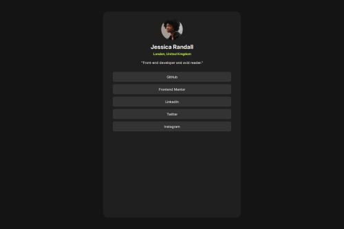
Solution retrospective


What are you most proud of, and what would you do differently next time?

I am proud that I did this one siting, However I do believe that I could have finished this quicker. I also wish to have completed the project the way it was wanted

What challenges did you encounter, and how did you overcome them?

I didn't make it active the way that it was required and I still couldn't

What specific areas of your project would you like help with?

Could someone please help me in making my project active the way it was required, as well as a different way to make it responsive

Code
Select a file

Please log in to post a comment

Log in with GitHub

Community feedback

  • P
    Steven Stroud•11,910
    @Stroudy
    Posted 8 months ago

    Exceptional work! You’re showing great skill here. I’ve got a couple of minor suggestions that could make this stand out even more…

    • Using a <main> tag inside the <body> of your HTML is a best practice because it clearly identifies the main content of your page. This helps with accessibility and improves how search engines understand your content.

    • Your heading elements <h1><h5>, Heading elements should be in sequentially-descending order (e.g., <h1>, <h2>, <h3>) to create a clear content structure, improving accessibility and SEO. Skipping levels or using them out of order can confuse screen readers, affect search engine rankings, and make your content harder to understand.

          <h1>Jessica Randall</h1>
          <h5>London, United Kingdom</h5>
    
    • I would put these into a <ul> <li>, and the text should be wrapped with a <a> so it is accessible with a keyboard using the tab key, Using an <a> tag for navigation is semantically correct, improves accessibility for screen readers, and ensures consistent behavior across browsers, unlike a <button> or a <div> not intended for links.
        <section class="links">
          <ul><a href="">GitHub</a></ul>
          <ul><a href="">Frontend Mentor</a></ul>
          <ul><a href="">LinkedIn</a></ul>
          <ul><a href="">Twitter</a></ul>
          <ul><a href="">Instagram</a></ul>
        </section>
    
    • Using a full modern CSS reset is beneficial because it removes default browser styling, creating a consistent starting point for your design across all browsers. It helps avoid unexpected layout issues and makes your styles more predictable, ensuring a uniform appearance on different devices and platforms, check out this site for a Full modern reset
    *{
        padding: 0;
        margin: 0;
        font-family: "Inter", sans-serif;
    }
    
    • I think you can benefit from using a naming convention like BEM (Block, Element, Modifier) is beneficial because it makes your CSS more organized, readable, and easier to maintain. BEM helps you clearly understand the purpose of each class, avoid naming conflicts, and create reusable components, leading to a more scalable codebase. For more details BEM,

    • While px is useful for precise, fixed sizing, such as border-width, border-radius, inline-padding, and <img> sizes, it has limitations. Pixels don't scale well with user settings or adapt to different devices, which can negatively impact accessibility and responsiveness. For example, using px for font sizes can make text harder to read on some screens, Check this article why font-size must NEVER be in pixels. In contrast, relative units like rem and adjust based on the user’s preferences and device settings, making your design more flexible and accessible. Use px where exact sizing is needed, but prefer relative units for scalable layouts. If you want a deeper explanation watch this video by Kevin Powell CSS em and rem explained. Another great resource I found useful is this px to rem converter based on the default font-size of 16 pixel.

    • Using rem or em units in @media queries is better than px because they are relative units that adapt to user settings, like their preferred font size. This makes your design more responsive and accessible, ensuring it looks good on different devices and respects user preferences.

    @media only screen and (max-width:770px)
    

    I hope you’re finding this guidance useful! Keep refining your skills and tackling new challenges with confidence. You’re making great progress—stay motivated and keep coding with enthusiasm! 💻

  • Nasif Fuad•300
    @Nasifuad
    Posted 8 months ago

    In the container no need to set a fixed height or width. It would make it more responsive and get rid of extra media queries. Add padding to the container that would make it look more good.

Join our Discord community

Join thousands of Frontend Mentor community members taking the challenges, sharing resources, helping each other, and chatting about all things front-end!

Join our Discord
Frontend Mentor logo

Stay up to datewith new challenges, featured solutions, selected articles, and our latest news

Frontend Mentor

  • Unlock Pro
  • Contact us
  • FAQs
  • Become a partner

Explore

  • Learning paths
  • Challenges
  • Solutions
  • Articles

Community

  • Discord
  • Guidelines

For companies

  • Hire developers
  • Train developers
© Frontend Mentor 2019 - 2025
  • Terms
  • Cookie Policy
  • Privacy Policy
  • License

Oops! 😬

You need to be logged in before you can do that.

Log in with GitHub

Oops! 😬

You need to be logged in before you can do that.

Log in with GitHub

How does the accessibility report work?

When a solution is submitted, we use axe-core to run an automated audit of your code.

This picks out common accessibility issues like not using semantic HTML and not having proper heading hierarchies, among others.

This automated audit is fairly surface level, so we encourage to you review the project and code in more detail with accessibility best practices in mind.

How does the CSS report work?

When a solution is submitted, we use stylelint to run an automated check on the CSS code.

We've added some of our own linting rules based on recommended best practices. These rules are prefixed with frontend-mentor/ which you'll see at the top of each issue in the report.

The report will audit all CSS, SCSS and Less files in your repository.

How does the HTML validation report work?

When a solution is submitted, we use html-validate to run an automated check on the HTML code.

The report picks out common HTML issues such as not using headings within section elements and incorrect nesting of elements, among others.

Note that the report can pick up “invalid” attributes, which some frameworks automatically add to the HTML. These attributes are crucial for how the frameworks function, although they’re technically not valid HTML. As such, some projects can show up with many HTML validation errors, which are benign and are a necessary part of the framework.

How does the JavaScript validation report work?

When a solution is submitted, we use eslint to run an automated check on the JavaScript code.

The report picks out common JavaScript issues such as not using semicolons and using var instead of let or const, among others.

The report will audit all JS and JSX files in your repository. We currently do not support Typescript or other frontend frameworks.

Oops! 😬

You need to be logged in before you can do that.

Log in with GitHub

Oops! 😬

You need to be logged in before you can do that.

Log in with GitHub