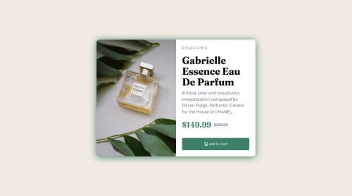
Not Found
Not Found
Not Found
Not Found
Not Found
Not Found
Not Found
Not Found
Not Found
Not Found
Not Found
Not Found
Not Found
Not Found
Not Found
Not Found
Not Found
Not Found
Not Found
Not Found

Submitted

Profile Preview Card with HTML and SASS

#sass/scss
Divine Obeten 2,435

@Deevyn9

Desktop design screenshot for the Product preview card component coding challenge

This is a solution for...

  • HTML
  • CSS
1newbie
View challenge

Design comparison


SolutionDesign

Solution retrospective


This is my first time working with SASS, any feedback would be really great.

Community feedback

Lucas 👾 104,580

@correlucas

Posted

👾Hello @Deevyn9, Congratulations on completing this challenge!

Your solution its almost done and I’ve some tips to help you to improve it:

1.I saw that you’ve used flexbox to place the content and create the layout. I think the best way to build this component with two columns is by using GRID LAYOUT since it is simpler to manage the columns and then create the media query for mobile. Here’s the steps to create it with grid create the main block to hold all the content (you can use <main> to wrap), set its width as max-width: 900px (it's the container size) and display: grid / grid-template-column: 1fr 1fr(this means that your component will have two columns with 50% of the container width each thats 450px). To manage the column with the text use flexbox and gap to give it the spacing between the texts or use padding-bottom to separate them. Then to create the mobile version, all you need to do is to change the container flow vertically with grid-template-column: 1fr.

2.Use the THE PICTURE TAG that is a shortcut to deal with the multiple images in this challenge. So you can use the <picture> tag instead of importing this as an <img> or using a div with background-image. Use it to place the images and make the change between mobile and desktop, instead of using a div or img and set the change in the css with display: none with the tag picture is more practical and easy. Note that for SEO / search engine reasons isn’t a better practice import this product image with CSS since this will make it harder to the image. Manage both images inside the <picture> tag and use the html to code to set when the images should change setting the device max-width depending of the device desktop + mobile.

Check the link for the official documentation for <picture> in W3 SCHOOLS: https://www.w3schools.com/tags/tag_picture.asp

See the example below:

<picture>
  <source media="(max-width:650px)" srcset="./images/image-product-mobile.jpg">
  <img src="./images/image-product-desktop.jpg" alt="Gabrielle Parfum" style="width:auto;">
</picture>

👨‍💻Here's my solution for this challenge if you wants to see how I build it: https://www.frontendmentor.io/solutions/product-preview-card-vanilla-css-and-custom-hover-state-on-hero-85A1JsueD1

✌️ I hope this helps you and happy coding!

Marked as helpful

1

Divine Obeten 2,435

@Deevyn9

Posted

Hi @correlucas, thank you for your feedback, I'll be implementing the changes you suggested and I'll take the suggested approach in my projects going forward.

P.S, I followed you on twitter.

Thanks.

1
Lucas 👾 104,580

@correlucas

Posted

@Deevyn9 Oh thats, nice I'll follow you back, can you say me your user?

0
Divine Obeten 2,435

@Deevyn9

Posted

@correlucas it’s “@cssSenpai”

0

@VCarames

Posted

Hey @Deevyn9, some suggestions to improve you code:

  • For this challenge you want to use the Picture Element not the Background Image Property. The Background Image Property is mainly used on decorative images

Picture Element will allow your to switch between images in different breakpoints and makes your site load faster by saving bandwidth.

Here is an example of how it works: EXAMPLE

Syntax:

  <picture>
    <source media="(min-width: )" srcset="">
    <img src="" alt="">
  </picture>

More Info:

https://www.w3schools.com/html/html_images_picture.asp

https://web.dev/learn/design/picture-element/

  • The old price 🏷 is not being announced properly to screen readers. You want to wrap it in a Del Element and include a sr-only text explaining that this is the old price.

  • Implement a Mobile First approach 📱 > 🖥

With mobile devices being the predominant way that people view websites/content. It is more crucial than ever to ensure that your website/content looks presentable on all mobile devices. To achieve this, you start building your website/content for smaller screen first and then adjust your content for larger screens.

Happy Coding! 👻🎃

Marked as helpful

1

Divine Obeten 2,435

@Deevyn9

Posted

@vcarames thanks for taking your time to go though my solution

0

Please log in to post a comment

Log in with GitHub
Discord logo

Join our Discord community

Join thousands of Frontend Mentor community members taking the challenges, sharing resources, helping each other, and chatting about all things front-end!

Join our Discord