


@correlucas
Posted
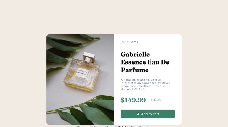
👾Hi @echoturnbull, congratulations on your first solution!👋 Welcome to the Frontend Mentor Coding Community!
Great solution and a great start! From what I saw you’re on the right track. I’ve few suggestions for you that you can consider adding to your code:
1.The image is getting distorted, to avoid this behavior, use these steps, first add display: block and max-width: 100% to the <img> selector. To improve the responsiveness even more by adding the auto-crop property you can add object-fit: cover to make the image crop inside the container. Here’s the code:
img {
    display: block;
    object-fit: cover;
    max-width: 100%;
}
2.Use <main> instead of <div> to wrap the card container. This way you show that this is the main block of content and also replace the div with a semantic tag.
3.You made your html structure entirely with div blocks but these div doesn't any semantic meaning, for this reason is better you use a better html markup improving your code, for example for each div img + text content you use <article> instead of the <div>.
4.Use the tag <picture>to wrap the product image inside the html instead of using it as <img> or background-image (with the css). Using <picture> you wrap both images (desktop and mobile) and have more control over it, since you can set in the html when the images changes setting the screen size for each image.ote that for SEO / search engine reasons isn’t a better practice import this product image with CSS since this will make it harder to the image.
Here’s the documentation and the guide to use this tag:
https://www.w3schools.com/tags/tag_picture.asp
✌️ I hope this helps you and happy coding!
Marked as helpful
@echoturnbull
Posted
@correlucas Hi Lucas! Thanks for taking the time to look at my solution, much appreciated!
I had been trying to figure out a better way to wrap everything and if I should import the image through css.
I’ll take a second run at it and see how I go!
