Not Found
Not Found
Not Found
Not Found
Not Found
Not Found
Not Found
Not Found
Not Found
Not Found
Not Found
Not Found
Not Found
Not Found
Not Found
Not Found
Not Found
Not Found
Not Found
Not Found

Submitted

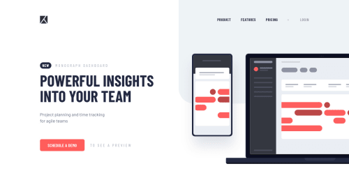
Project Tracking Component - SCSS, Flexbox, Fluid Typography, JS

Anna Leigh 5,135

@brasspetals

Desktop design screenshot for the Project tracking intro component coding challenge

This is a solution for...

  • HTML
  • CSS
  • JS
2junior
View challenge

Design comparison


SolutionDesign

Solution retrospective


I really enjoyed this one, and what took me the longest was figuring out how I wanted everything to respond. Hopefully stacking and hiding the mobile menu icons instead of switching the src isn’t a horrible coding sin - I wanted to use inline svg so that I could create hover and focus effects. Feedback is very appreciated - let me know what you think, and if you see anything that could be done better!

Community feedback

P
ApplePieGiraffe 30,545

@ApplePieGiraffe

Posted

Why, hello, Anna! 👋

Wonderful job on this challenge! Your solution looks just like the design and the transition of the mobile navigation is really nice! 🤩

Your code looks very good and I like how simple your JS is! 😉

Your solution also scales very nicely and the fluid typography is a nice touch! 👍

Keep coding (and happy coding, too)! 😁

1

P
ApplePieGiraffe 30,545

@ApplePieGiraffe

Posted

@ApplePieGiraffe

Say, just a tiny note on fluid typography using vw units—this means that users will have less control over the font-size of a webpage if they change the default font-size of their browser (since those changes are reflected in rems and ems, but not vh or vw units)—which poses a slight accessibility issue (since a large part of the reason setting font-sizes and other things in rem is considered a good practice is so that the design will scale well for users who change the default font-size of their browser).

There are some JS solutions to make accessible, fluid typography, but one thing that might help is to set the font-size of elements in the page to a combination or em or rem units and vw units (e.g., font-size: clamp(2rem, calc(2rem + 4vw), 5rem)) so that if the user changes the default font-size of their browser, those changes are at least partially reflected in the typography of the page. 😉

IDK—fluid typography is really very fun and I'd like implementing it for fun projects like this. Just a note I thought I'd share to keep in mind for the future! 😊

1
Anna Leigh 5,135

@brasspetals

Posted

@ApplePieGiraffe

Thanks for sharing that article - it was really insightful! I hadn't considered the accessibility issues of using vw. Adding the calc function does seem like a decent (and clever) compromise. It's all definitely something to keep in mind - at least it's nice to have projects like these to experiment with!

And as always, thank you so much for the thoughtful feedback and encouragement - it's appreciated!

1

Please log in to post a comment

Log in with GitHub
Discord logo

Join our Discord community

Join thousands of Frontend Mentor community members taking the challenges, sharing resources, helping each other, and chatting about all things front-end!

Join our Discord