


David Frederick• 15
@david-r-frederick
Posted
NoorAlhijab, Looks great overall! A few things I'd fix.
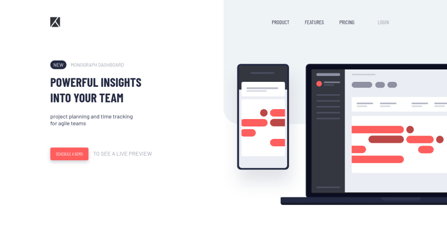
- Make the laptop and phone align to the right edge and use more whitespace in the middle with screens that are bigger than yours. I'm thinking something like justify-content: space-between in a flex display. Also, tied with this is that I'd probably make the navbar at the logo in the top left separate items so that justify-content can work on the left side and the right side.
- The navbar items go out of the gray box when you squish the screen a bit (horizontally). This should be fixed if you do number 1. Alternatively, you could just make your hamburger button show up sooner.
- A small thing, but I would add some sort of transition for your hamburger button/menu. It just pops up sharply. I'd probably make it come in from the right, but that's sort of up to personal preference.
0
NoorAlhijab• 385
@NoorAlhijab
Posted
Thank you for adding this comment, this helps to improve my code, I still a newbie.
0

