


Raymart Pamplona• 16,090
@pikapikamart
Posted
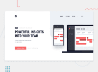
Hey, awesome work on this one. Desktop layout looks great, it is responsive and mobile state looks great as well.
Some suggestions would be:
- You shouldn't have used
headerto wrap the whole layout. Instead on this one, you should have:
<header />
<main />
header only contains the topmost part, the navbar and the rest should be inside the main as they are the main-content of the page.
- Since you are treating the website-logo a link, include it inside the
navsince it is navigational link. - Website-logo-link
atag should have eitheraria-labelattribute orsr-onlytext inside, that describes where the link would take the user. Usually, website-logo directs user to homepage so usehomepageas the value like `aria-label="homepage". - Remember that a website-logo is one of the meaningful images on a site so use proper
altfor it. Use the website's name as the value likealt="sneakers". - Remember that a website-logo is one of the meaningful images on a site so use proper
altfor it. For this, since it is hard to tell the name, you could useproject trackingas the name for theimg. - Include the
logininside theul. - You don't need to use
figureon the image because,figureis used combine with itsfigcaptiontag. - Add an extra
aria-hidden="true"on the hero-section image. Decorative images should be hidden for screen-reader at all times by usingalt=""andaria-hidden="true"to theimgtag or onlyaria-hidden="true"if the image is usingsvg. - I think monograph dashboard could be the
h1on this? Since if you think about it, it is more descriptive thanPOWERFUL INSIGHTS INTO YOUR TEAMright, to describe the section. - The
to see a previewis not really a interactive component, that would be just a plain text so useptag on it.
MOBILE
- hamburger menu should be using a
buttonsince it is an interactive component.
SUPPOSING BUTTON IS USED
- The
buttonshould have a default atribute ofaria-expanded="false"and it will be set totruewhen the users toggles it and vice-versa. - The hamburger
buttonshould have eitheraria-labelattribute orsr-onlytext inside it which defines what thebuttondoes. You could usearia-label="navigation dropdown menu"
Aside from those, great job again on this one.
1
