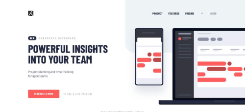
Submitted almost 6 years agoA solution to the Project tracking intro component challenge
Project tracking intro component - using Sass and Flexbox

@argelomnes
Solution retrospective
About halfway through it felt like I'm overusing media queries. I have lessen them before completing the challenge. Question is, how much is too much?
current breakpoints: 8 (inside _variables.scss) maximum used in 1 selector: 3 (ie, main and h3)
Code
Loading...
Please log in to post a comment
Log in with GitHubCommunity feedback
No feedback yet. Be the first to give feedback on argel omnes's solution.
Join our Discord community
Join thousands of Frontend Mentor community members taking the challenges, sharing resources, helping each other, and chatting about all things front-end!
Join our Discord