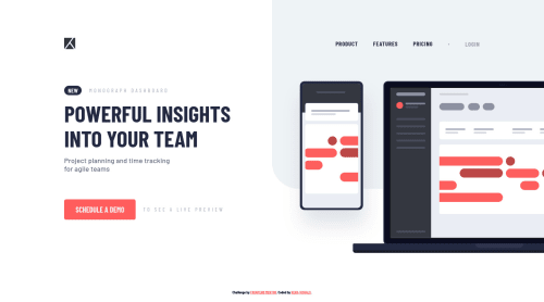
Project Tracking Intro Component with SCSS, CSS Animations, and BEM

Solution retrospective
In the Blogr Landing Page, there were sections similar to this project. The image was slightly out of the screen and when I was first implementing it, the part was a bit frustrating for me. However, that experience helped me to build this project a lot faster and a lot cleaner. This was the last small project of this level, the rest are whole landing pages. And I've got only 5 projects left to finish this level completely. I'm going to finish them by the end of the year.
Leave your thoughts in the comments' section 👨🏻💻 Cheers 👾
Please log in to post a comment
Log in with GitHubCommunity feedback
No feedback yet. Be the first to give feedback on Ken’s solution.
Join our Discord community
Join thousands of Frontend Mentor community members taking the challenges, sharing resources, helping each other, and chatting about all things front-end!
Join our Discord