Please log in to post a comment
Log in with GitHubCommunity feedback
- @sharmaakshara
THANKS ! FOR YOUR ADVICE
- @OneManBanned
Hi Akshara - A few bits of advice to improve your solution.
HTML
- The <h3> should be a <h1>. Remember heading elements must not skip heading levels: always start from <h1>, followed by <h2> and so on.
- The <div class"main"> should be a <main> tag. The <main> HTML element represents the dominant content of the <body> of a document.
- You don't need to put each line of text into a <p> tag and a lot of <div> elements aren't required. it would be better to organize if like so ...
<body>
    <main class="main">
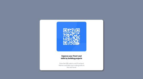
        <img class="type" src="./images/image-qr-code.png">
        <h1> Improve your front-end skills by building projects </h1>
        <p>Scan the QR code to visit Frontend
            Mentor and take your coding skills to
            the next level</p>
    </main>
</body>
CSS
- I think if you implement the simplified HTML you may be able to reduce your CSS quite a bit.
- try not to add fixed heights and widths. Instead use max and min heights this helps make elements a lot more responsive. This also applies to using relative units instead of pixels.
- For example try removing the padding and margin declarations you currently have on your
.mainclass and instead addwidth: 90%; max-width: 20rem - then center this by adding the following to the
.body
min-height: 100vh;
  display: flex;
  align-items: center;
  justify-content: center;
and finally this to your <img>
margin: auto;
  width: 90%;
You'll notice that adding these more flexible units (vh, % and rem) you have solved most of your problems. Just need to add some margin to the top and bottom and you're home and dry.
I hope you find some of that useful. Happy coding!!!
Join our Discord community
Join thousands of Frontend Mentor community members taking the challenges, sharing resources, helping each other, and chatting about all things front-end!
Join our Discord